Compare Historical and 2050s Heat Event Changes
This example shows how the Heat Trends Explorer can be used to compare the intensity, duration, and frequency of heat events between a historical simulation and the same weather replayed under a hotter future climate. By selecting Niagara Falls and reviewing heat event characteristics, temperature thresholds, and hourly temperature graphs, we can see how a historically limited heat event can become longer, hotter, and more widespread in the future replay.
This approach can be applied by first identifying areas with large simulated heat increases, then using the Heat Event Characteristics, Temperature Thresholds, and Hourly Temperature Graphs tabs together. The results can help users understand whether future risk is driven by more frequent heat events, longer event duration, higher heat-index intensity, reduced nighttime cooling, or a combination of these factors. This information can support local heat planning, public-health messaging, and prioritization of areas where heat events may become more dangerous under a hotter climate.
Identify Location(s)
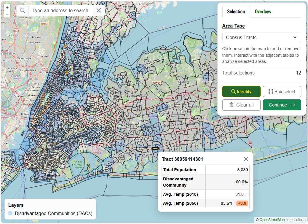
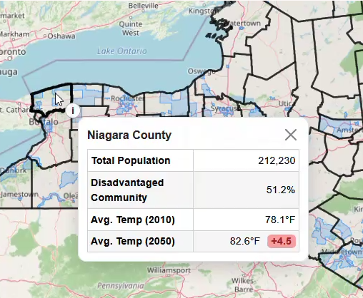
First, identify the part(s) of the state with the greatest modeled temperature increase. Select ‘Counties’ for Area Type, then use the Identify icon to click areas and view summary statistics.
The largest average temperature increases occur in western New York, particularly along the Great Lakes. Niagara Falls is selected for this example because it has an average maximum temperature increase of 4.6°F, more than a 6x increase in heat event days, over 45,000 residents, and 84% of residents classified as living in a disadvantaged community (DAC).
In the Overview tab, the selected layer color and display name can be customized. The project and the Land, Climate, Census, and HVI tables can also be exported from this pane.
Heat Event Characteristics
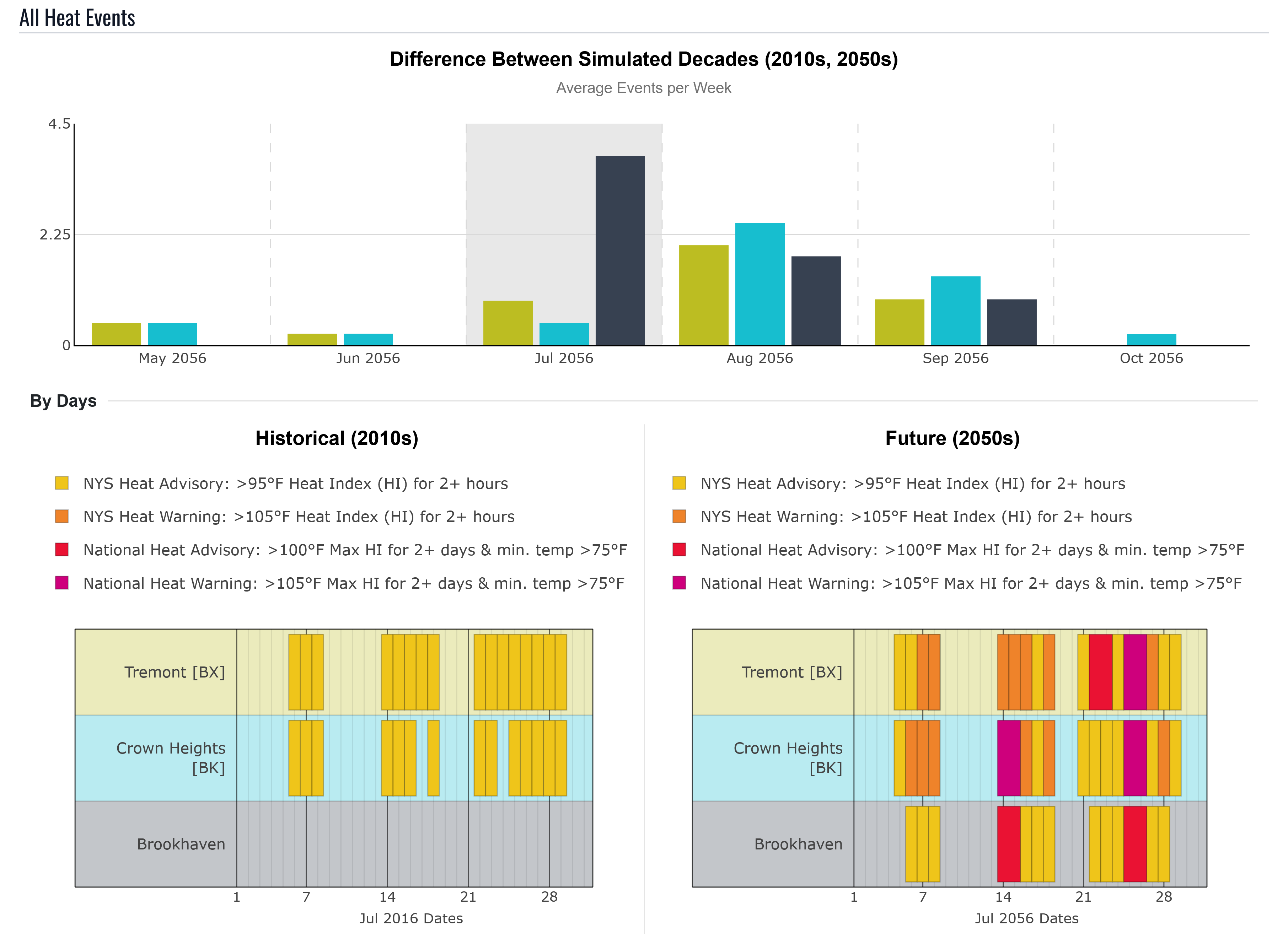
The Heat Event Characteristics tab summarizes four heat event types across the 10-year historical simulation and 10-year 2050s replay. The thresholds use heat index, which combines air temperature and humidity to estimate how hot conditions feel to the human body:
| Event Type | NYS Heat Advisory | NYS Heat Warning | National Heat Advisory | National Heat Warning |
|---|---|---|---|---|
| Heat Event Threshold | >95°F Heat Index2+ hours | >105°F Heat Index2+ hours | >100°F max Heat Index2+ days and minimum air temperature >75°F | >105°F max Heat Index2+ days and minimum air temperature >75°F |
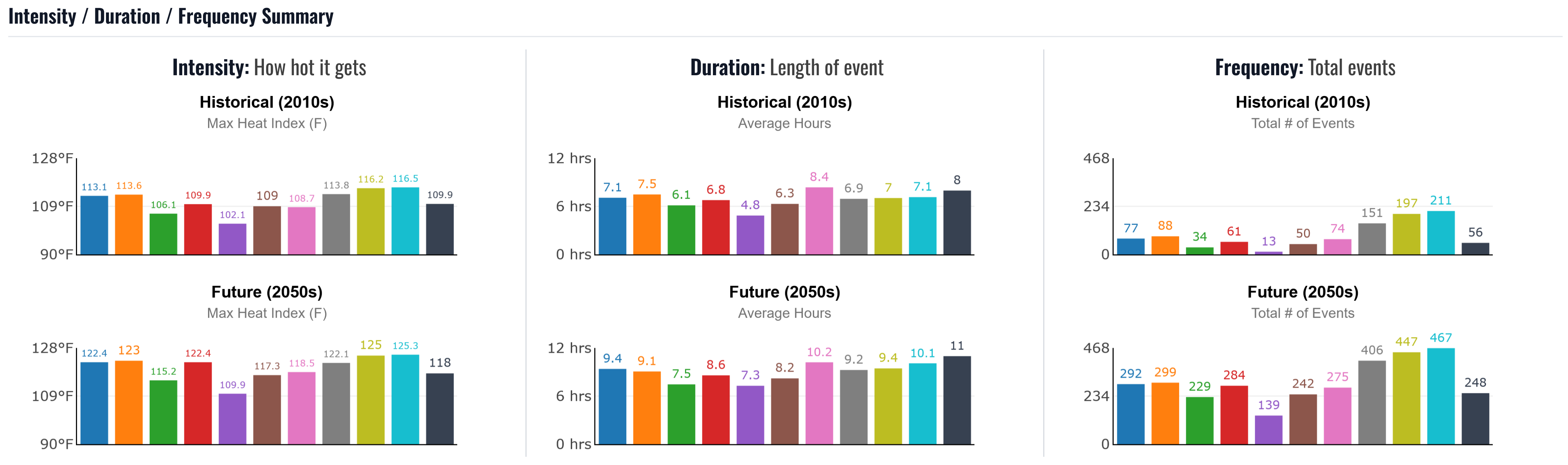
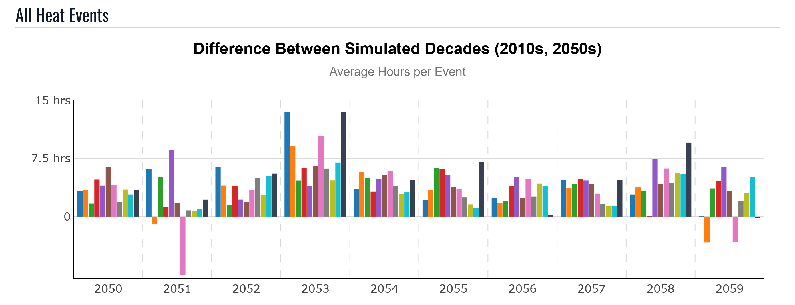
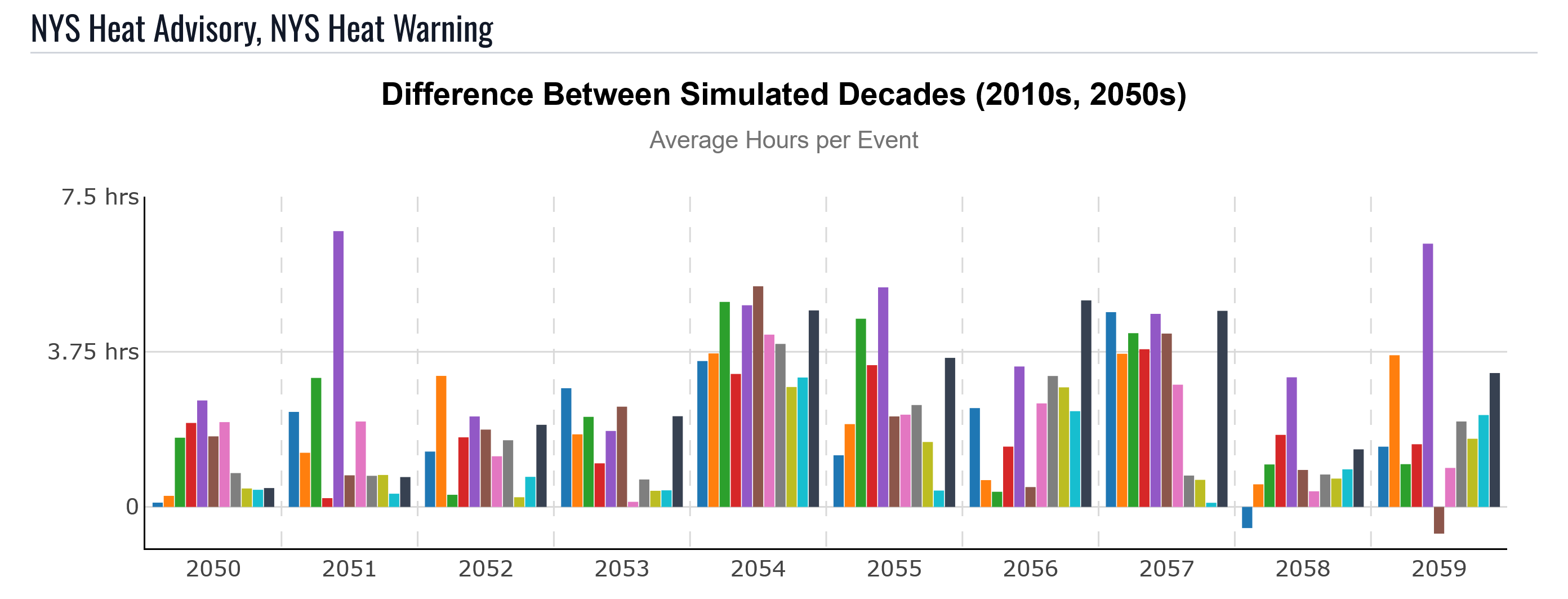
Below the Intensity/Duration/Frequency summary, the tool shows heat events by year. By default, the graph displays the maximum heat index reached by any event in the selected timeframe. The controls can switch to average heat index, or to total and average duration and frequency metrics.
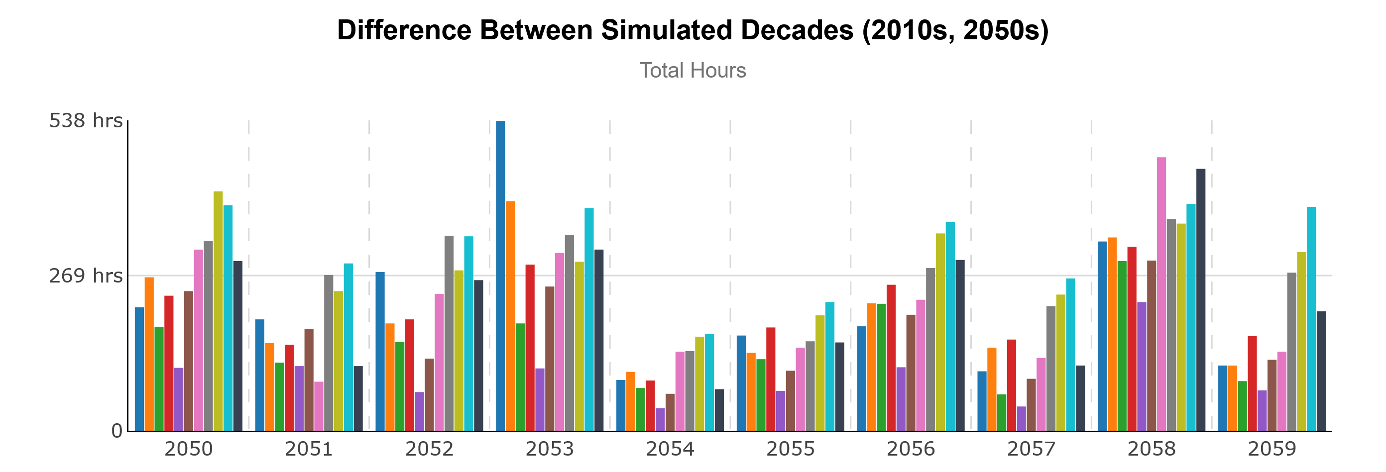
Duration shows how much longer heat events become in the 2050s replay. Increases can come from the same historical event lasting longer, or from events that were not extreme in the historical simulation crossing advisory or warning thresholds when replayed under the hotter climate.
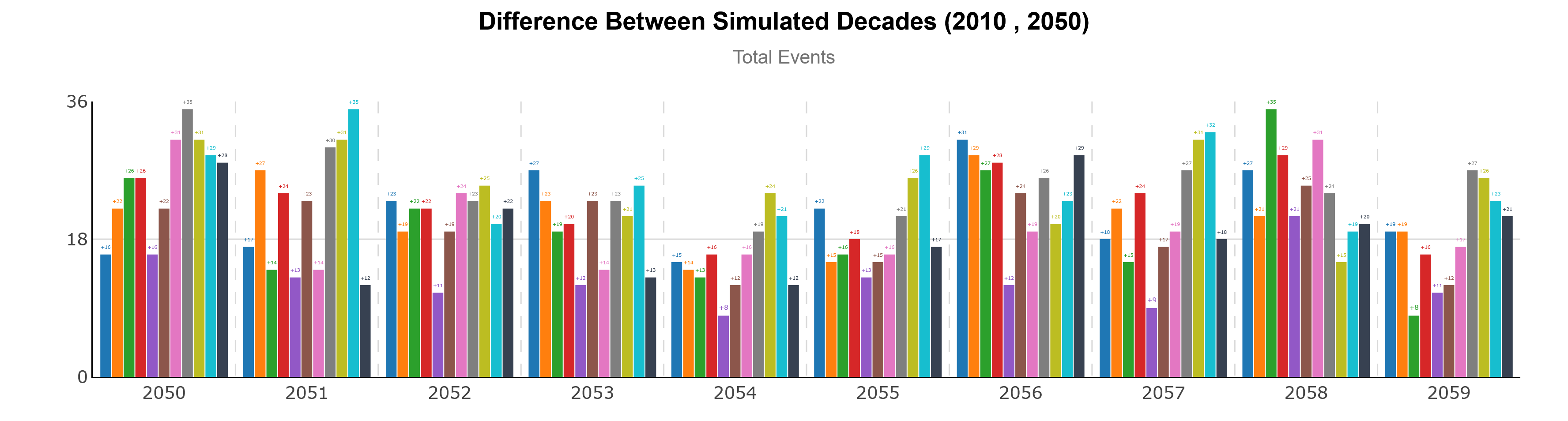
Frequency shows how many additional events cross a heat threshold. In some years, Niagara Falls has up to 10 times as many events in the 2050s replay; years with no historical events can also gain multiple heat event days.
Use to filter event types. For example, filtering to National events shows that no historical events met the multi-day National Heat Advisory or Warning criteria. This suggests that the historical events were single-day events with enough nighttime cooling to avoid multi-day classifications.
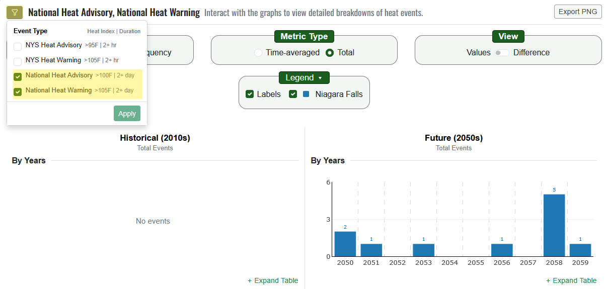
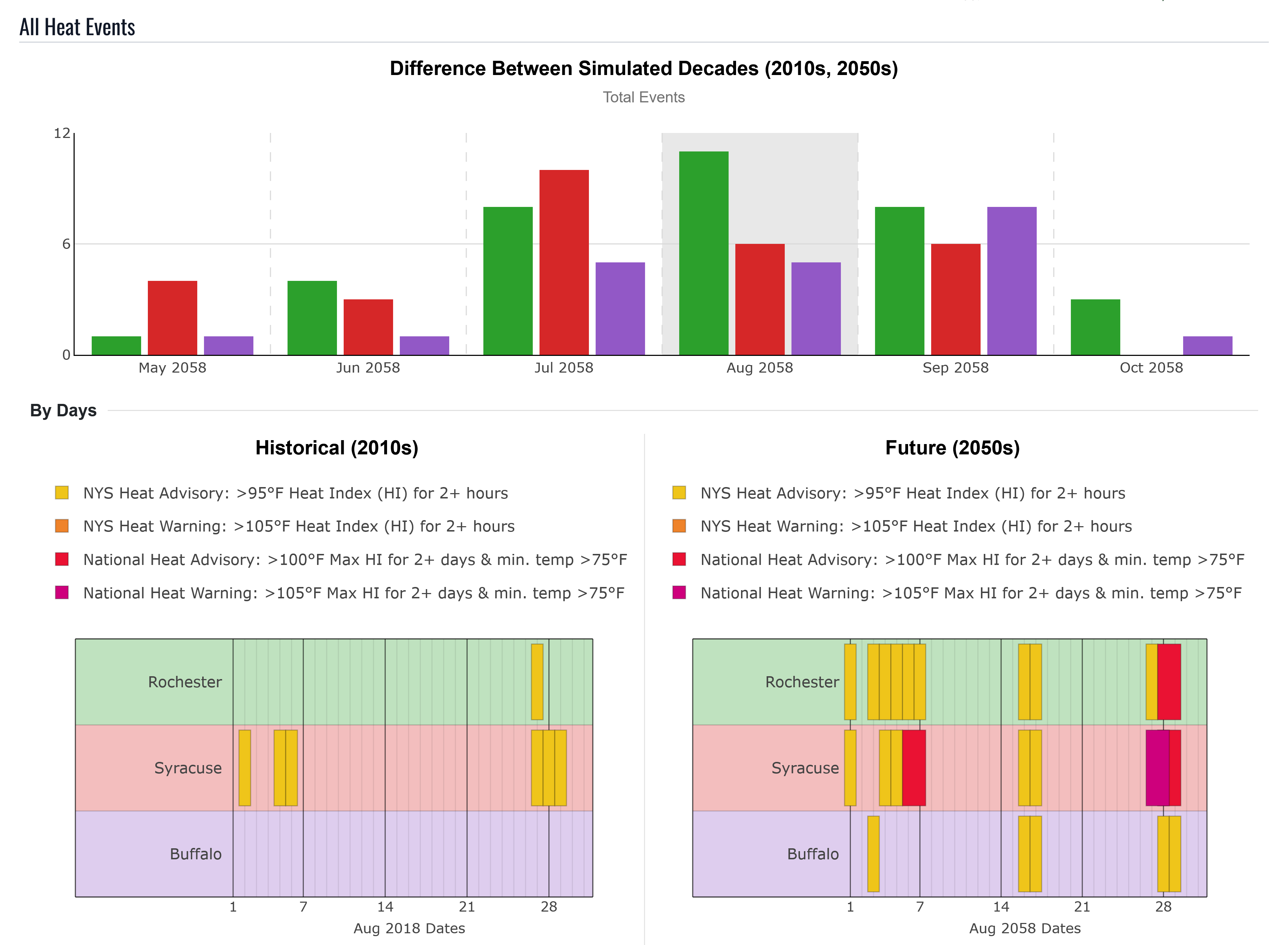
Clicking any year shows the monthly breakdown. In this example, 2016 is selected because it has the greatest number of historical events.
The monthly breakdown shows no simulated heat events in June for either the historical simulation or the 2050s replay. May and September each double in total events, July increases 7x, and August increases 4x while still having the largest total number of events. Clicking a date in August opens the daily breakdown for that event.
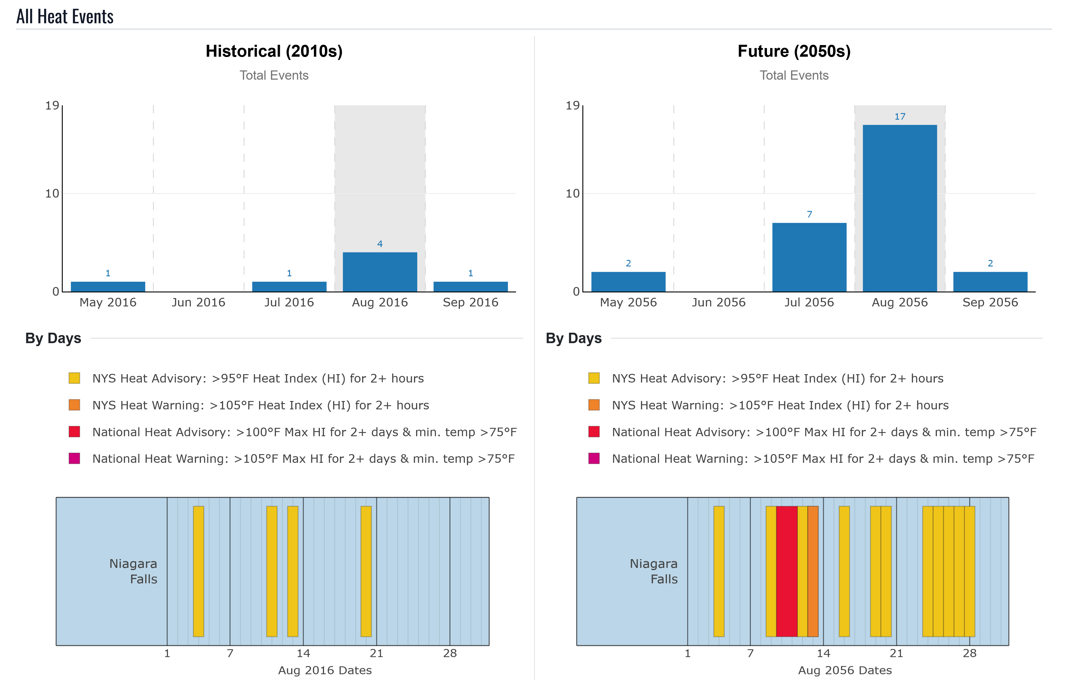
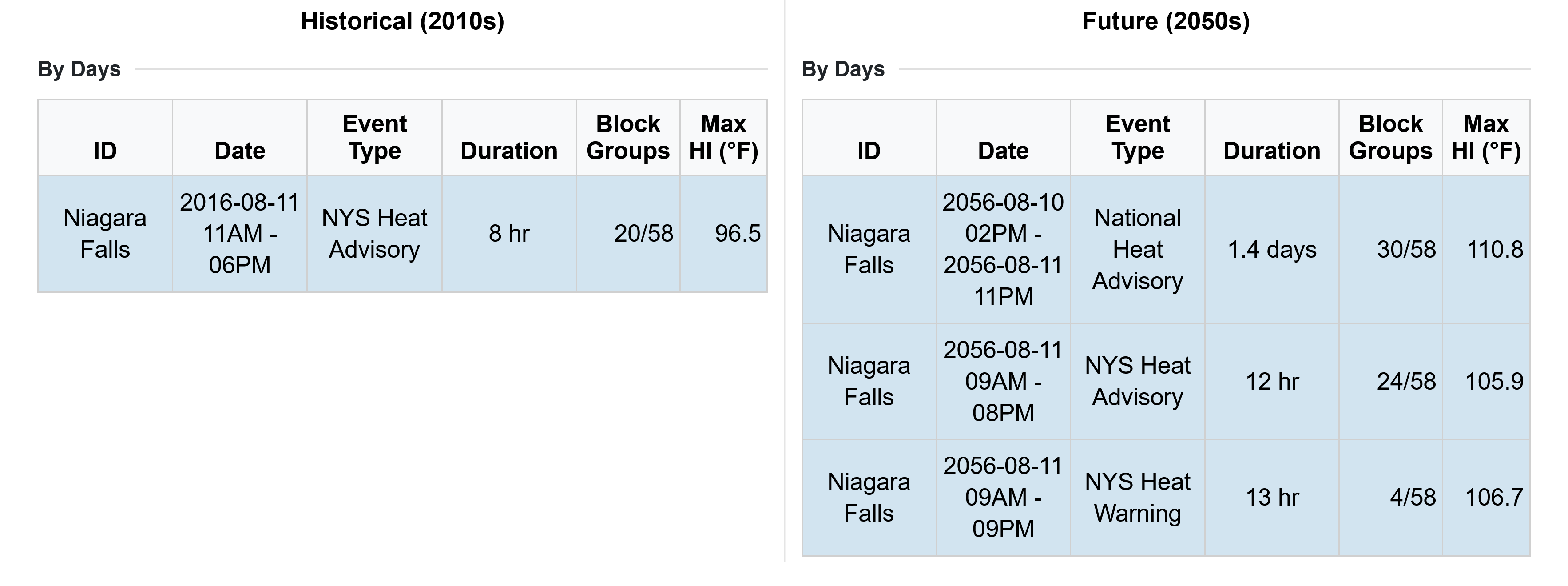
The daily table shows that:
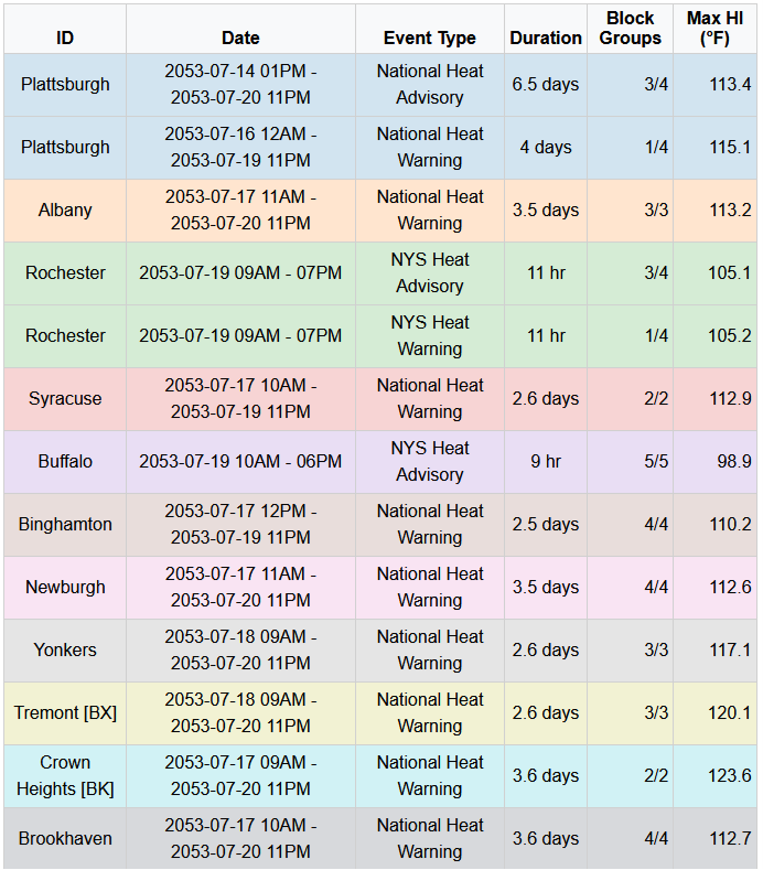
- The historical heat wave had 8 hours above 95°F heat index in Niagara Falls, affecting 20 of the city’s 58 block groups. The highest heat index across any block group was 96.5°F, indicating that roughly half of the city experienced high afternoon heat-index values.
The 2050s replay varies across the city:
- 30 block groups experienced a multi-day National Heat Advisory, with a maximum heat index of 110.8°F. Although this value is above the National Heat Warning threshold, the Warning requires every day in the event to exceed 105°F heat index; at least one day in this grouping was above 100°F but below 105°F.
- 24 block groups experienced a NYS Heat Advisory, defined as 2 or more hours above 95°F heat index. The highest labeled heat-index value was 105.9°F, meaning at least one block group briefly exceeded the NYS Heat Warning threshold but did not remain above it long enough to qualify as a Warning.
- The remaining four block groups were under a NYS Heat Warning, defined as 2 or more hours above 105°F heat index, with event duration measured from the period above 95°F heat index. These block groups experienced at least 2 hours above 105°F and sustained heat-index exposure above 95°F from 9 AM to 9 PM.
These results show three spatial heat patterns. The urban core reaches heat-index values up to 110.8°F and has limited nighttime cooling between two high-heat days. A transition zone also reaches high daytime heat index but can cool below 75°F overnight, providing some physiological relief. The remaining block groups still experience moderately high daytime heat, but at lower intensity than the 34 block groups in the higher-risk zones.
This section shows how the Heat Event Characteristics tab can move from a broad decade-level comparison into a specific event-day interpretation. For Niagara Falls, the August 10 comparison shows that the 2050s replay is not just hotter; it also changes the type, duration, and spatial extent of heat risk. A historical afternoon heat event affecting part of the city becomes a future event where all block groups meet some heat event threshold, with the urban core differentiated as experiencing the highest heat index values and limited nighttime cooling. This aids in understanding whether future heat risk is driven by higher intensity, longer duration, more frequent events, broader exposure across the city, or a combination of all four.
Temperature Thresholds
The tool tracks air temperature, heat index, and wet bulb globe temperature (WBGT). WBGT combines air temperature, humidity, wind, and solar radiation to estimate heat stress. For each temperature type, the tool summarizes the daily maximum using three statistics:
- Minimum: the daily maximum temperature reached at the coolest pixel within the selected area. This often represents high tree cover and low impervious cover, and helps identify whether any outdoor relief from high temperatures exists within the area.
- Mean: the area-averaged value across all block groups for the maximum-temperature hour. This is best for understanding average heat exposure across the selected area.
- Maximum: the daily maximum temperature reached at the hottest pixel within the selected area. This often represents low tree cover and high impervious cover, and helps identify the highest potential heat exposure in the area.
Because Niagara Falls is close to the Great Lakes, humidity can make heat index higher than air temperature. Comparing minimum, mean, and maximum values helps explain how the hottest days affect both the full city and its most extreme locations.
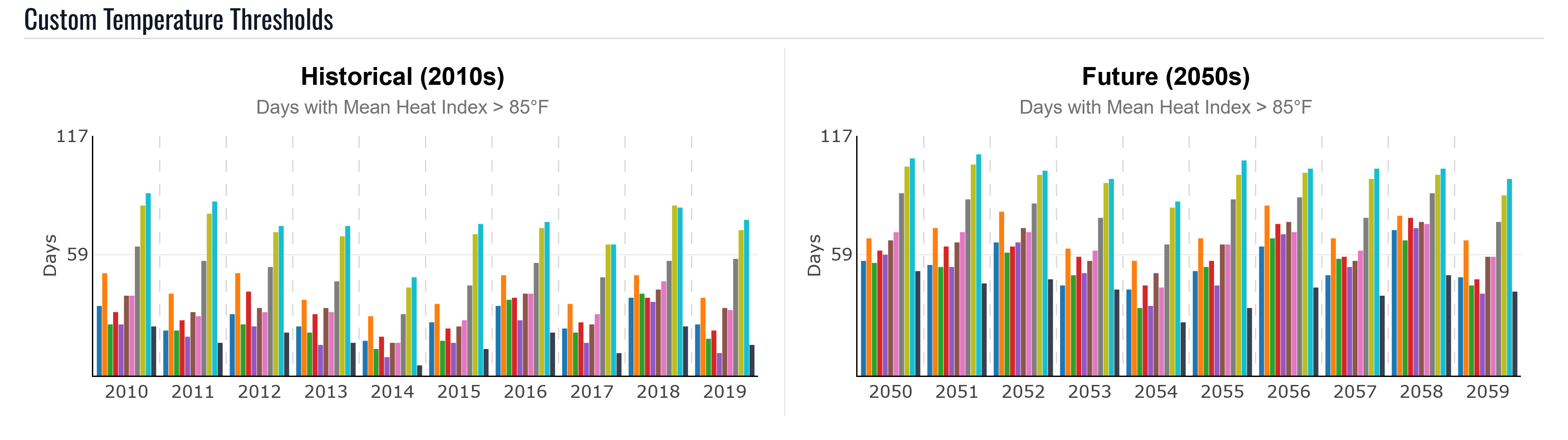
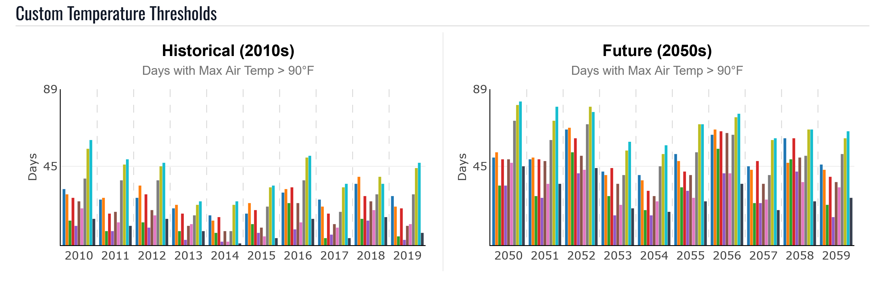
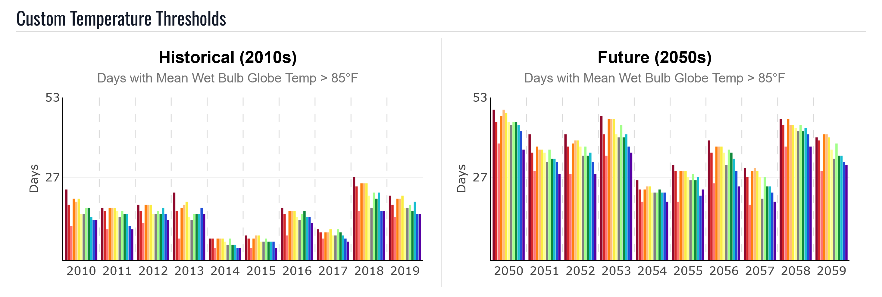
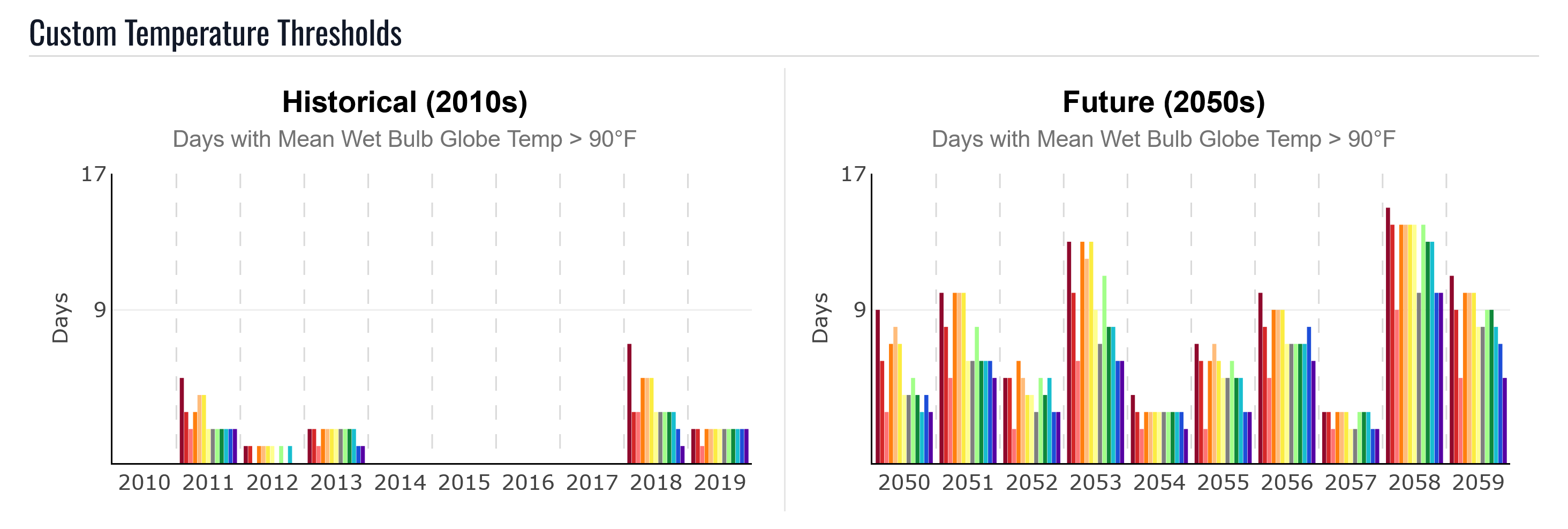
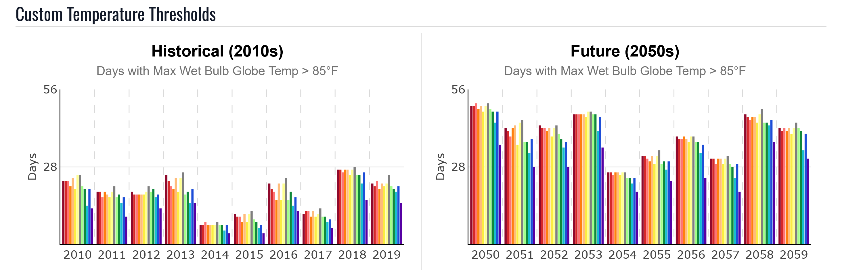
The default graph shows a notable increase between the historical simulation and the 2050s replay. It counts days when the citywide average heat index is above 85°F at the hottest hour of the day, including forested areas within the city boundary.
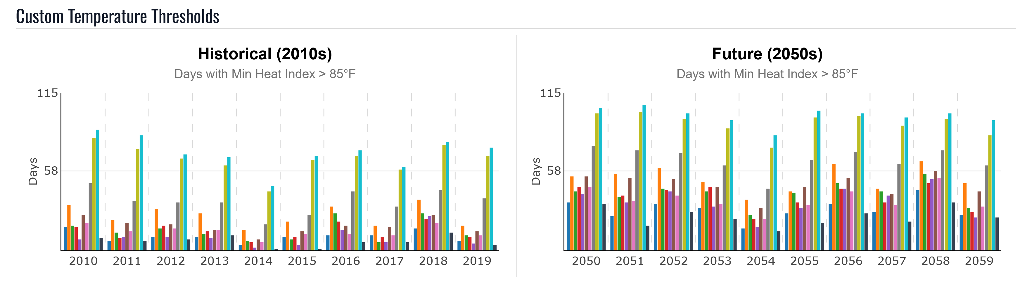
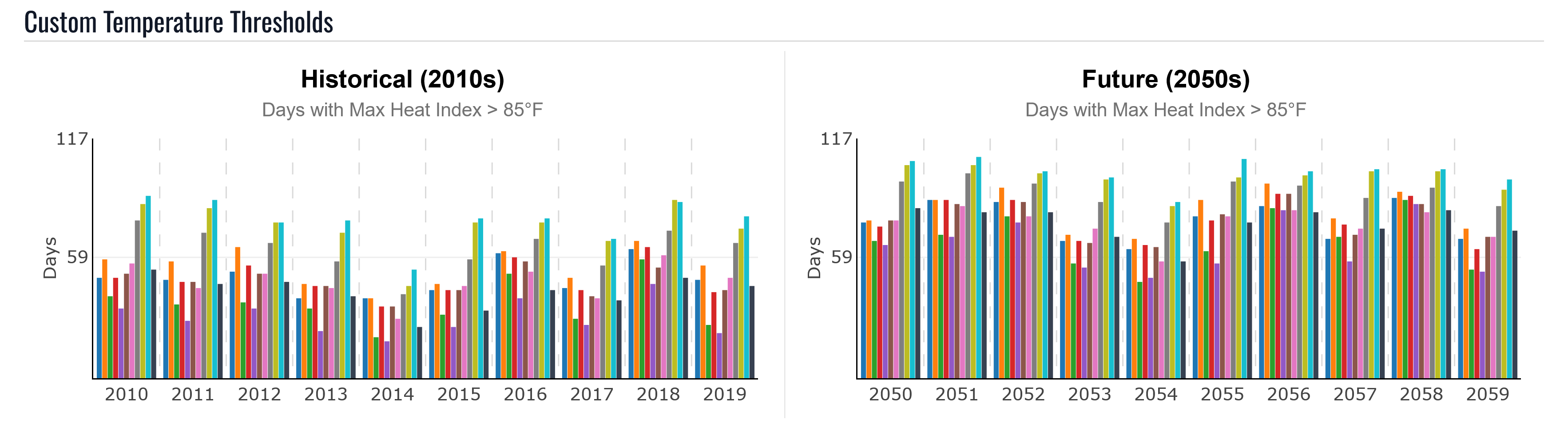
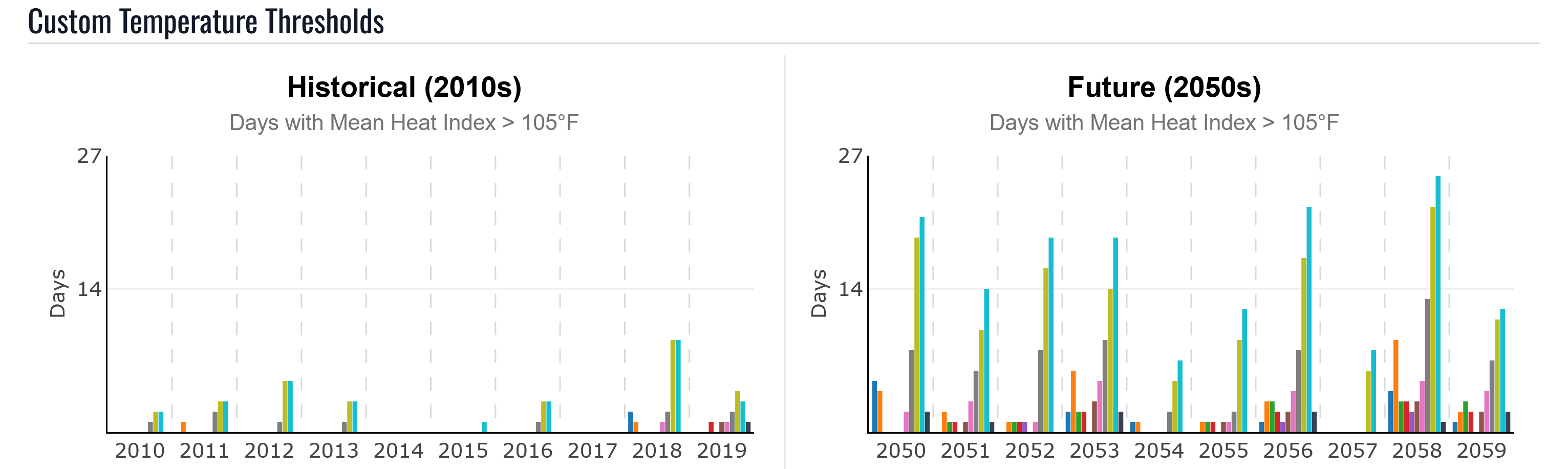
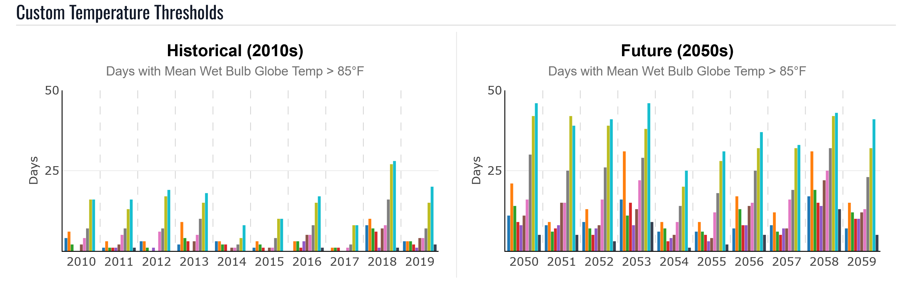
The threshold graphs show the following patterns:
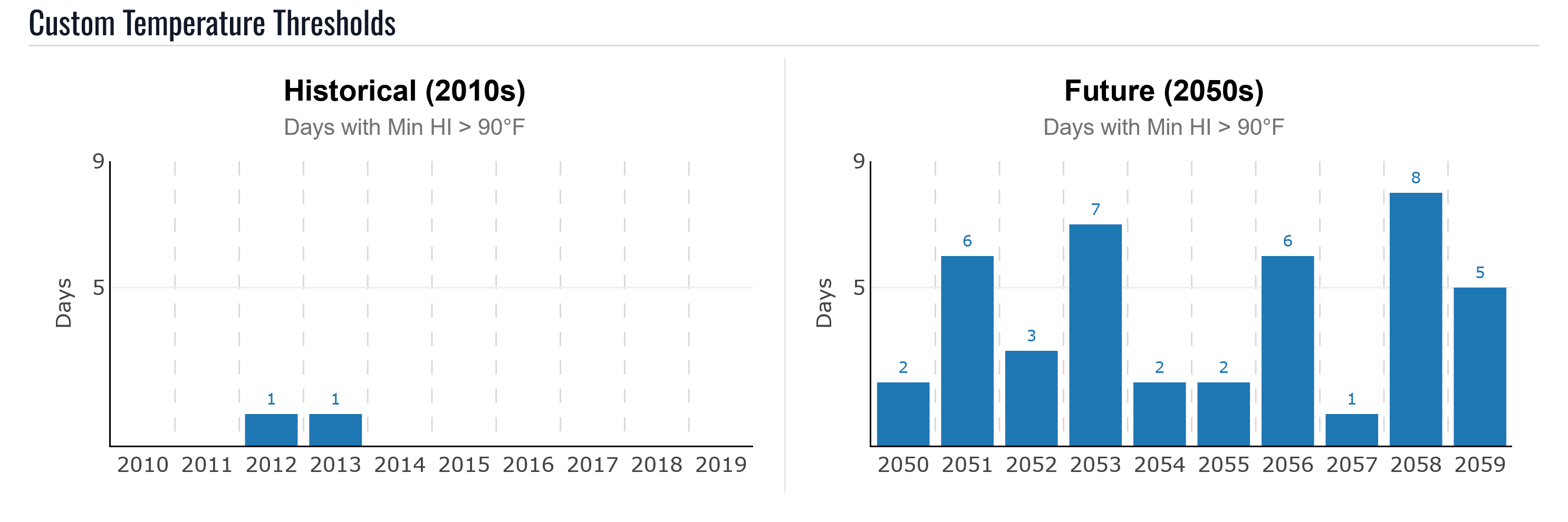
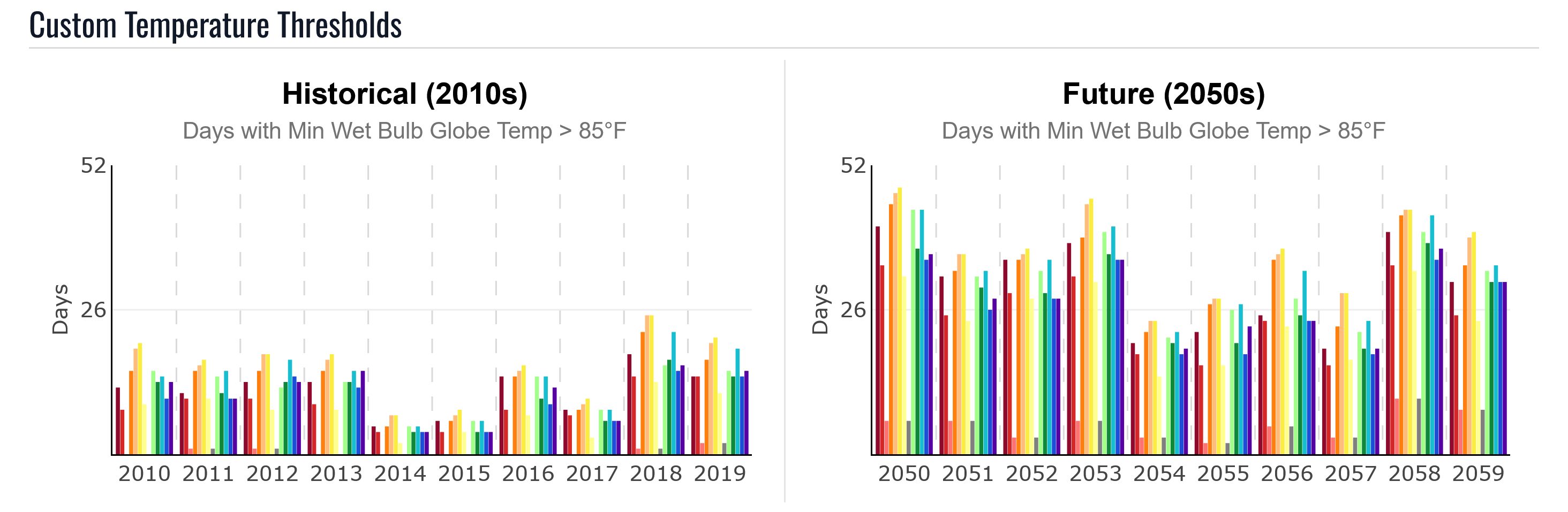
On the hottest historical days, the minimum heat index at the hottest hour was rarely above 90°F. When it did exceed 90°F, the mean heat index was usually above 95°F. In the 2050s replay, the minimum heat index exceeds 90°F on up to 8 days per year.
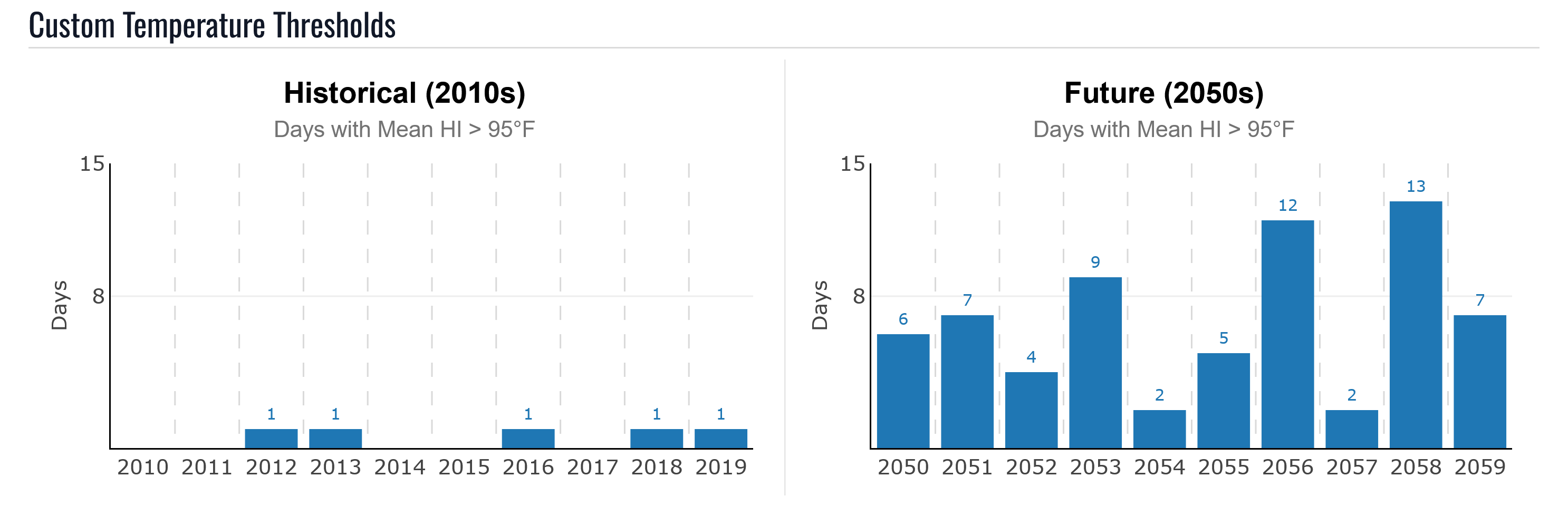
In the historical simulation, some years had only one day with an average maximum heat index above 95°F. In the 2050s replay, multiple days exceed that threshold each year.
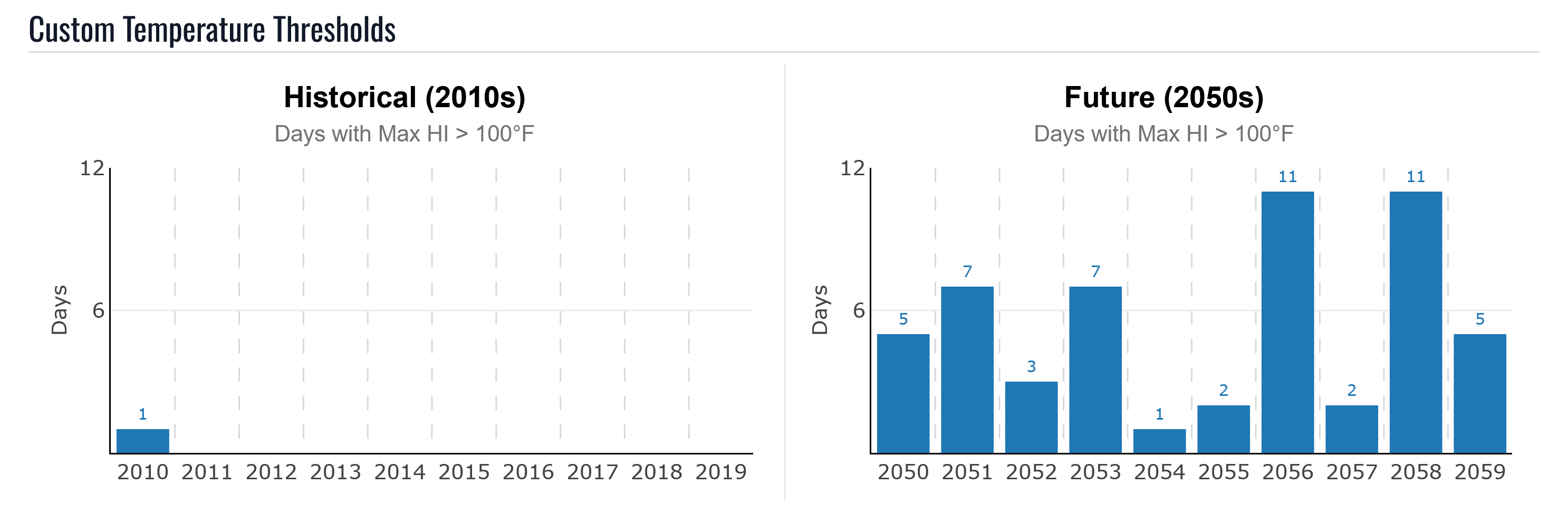
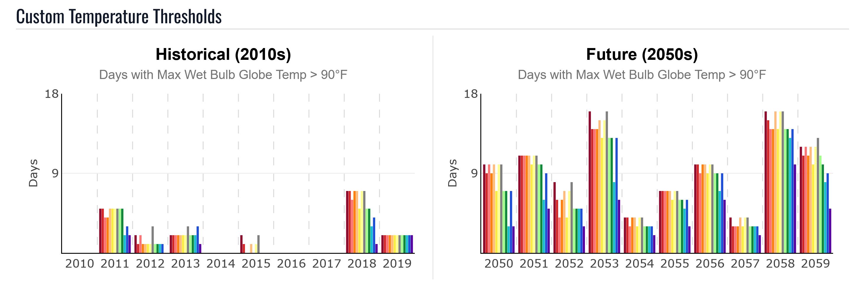
In the historical simulation, only one day had a maximum heat index above 100°F. In the 2050s replay, every year has at least one such day, and hotter years have more than a week of days with maximum heat index above 100°F.
To analyze seasonal timing, move year by year to identify early-season (May) and late-season (September) high temperatures, which can be important because people may be less acclimated at the beginning and end of the warm season.
Hourly Temperature Graphs
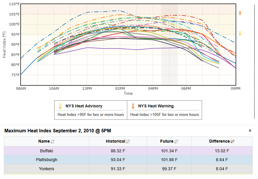
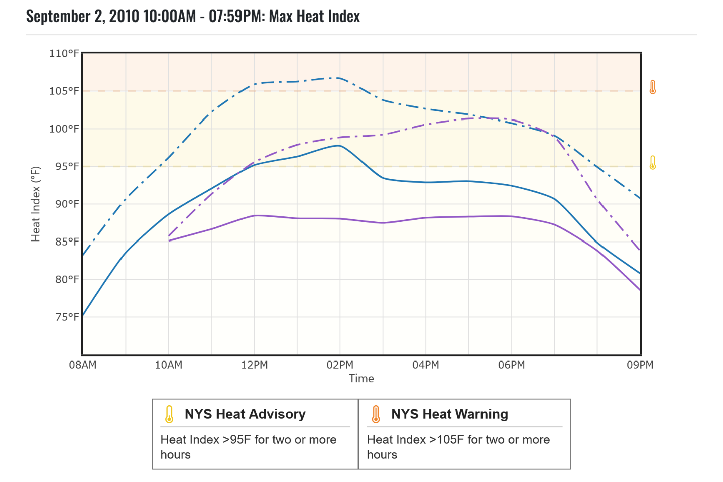
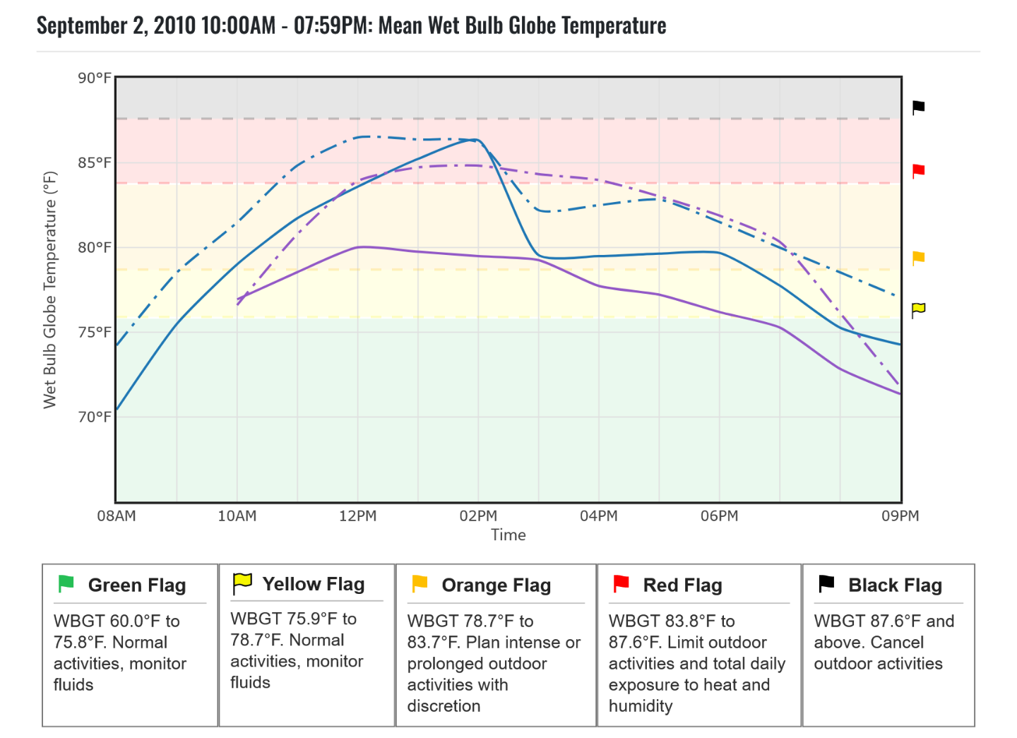
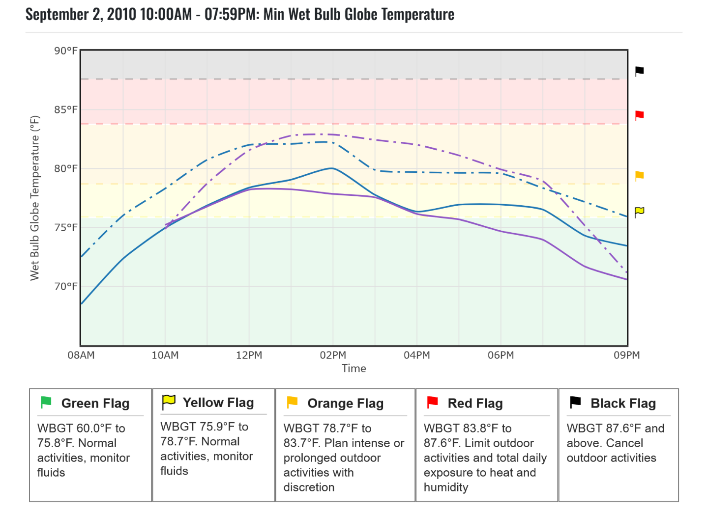
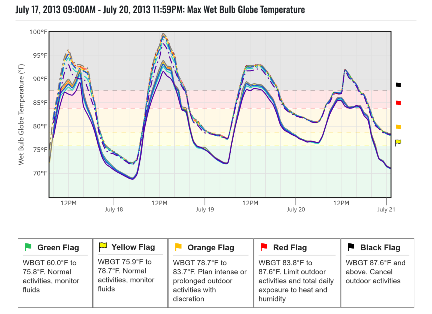
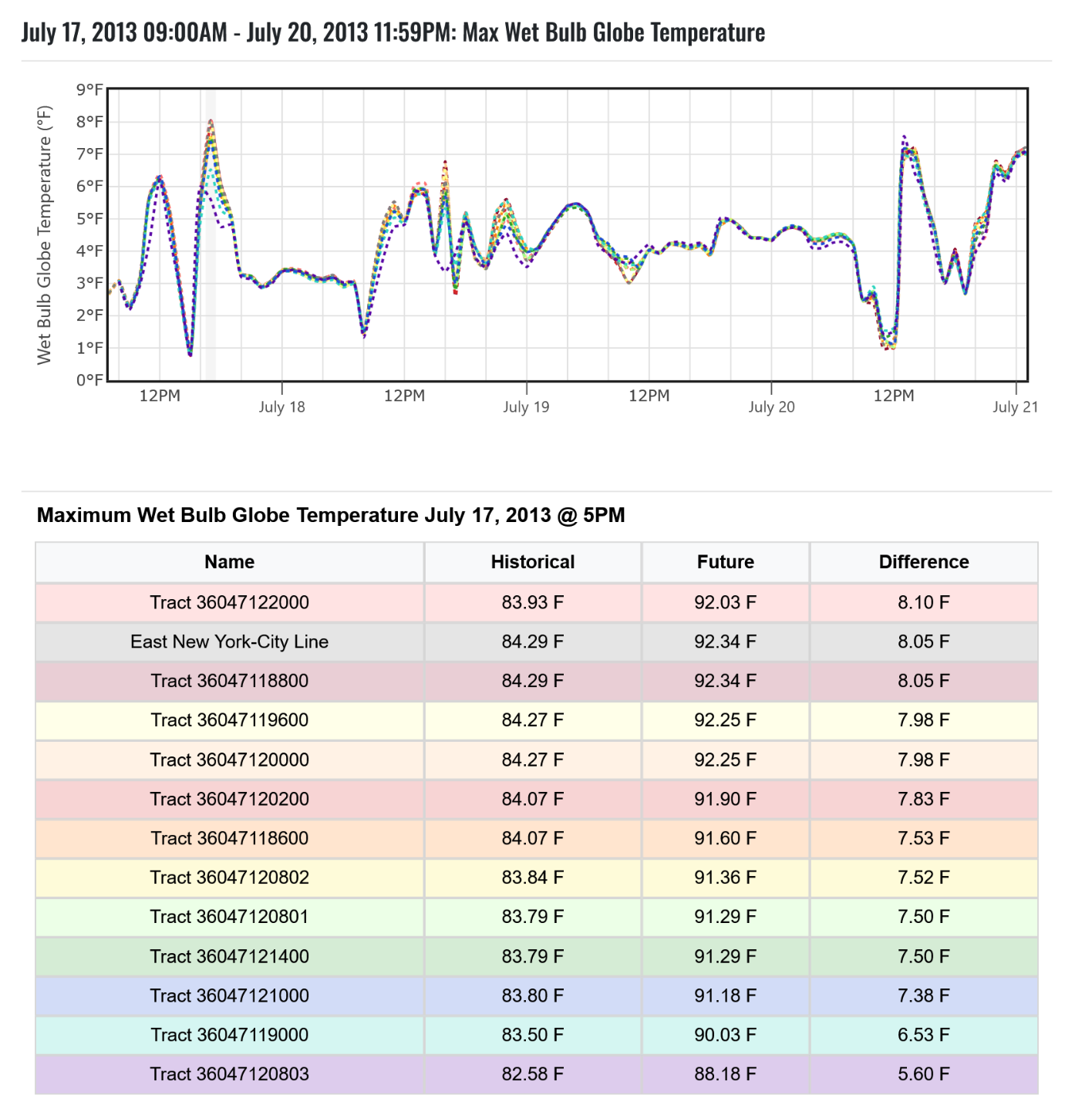
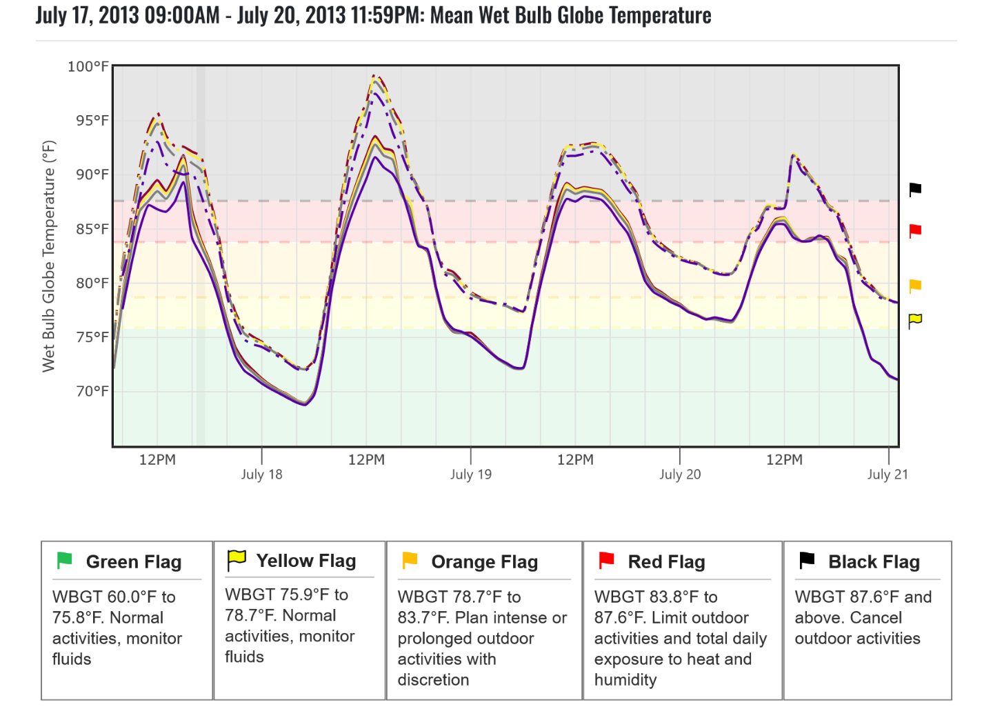
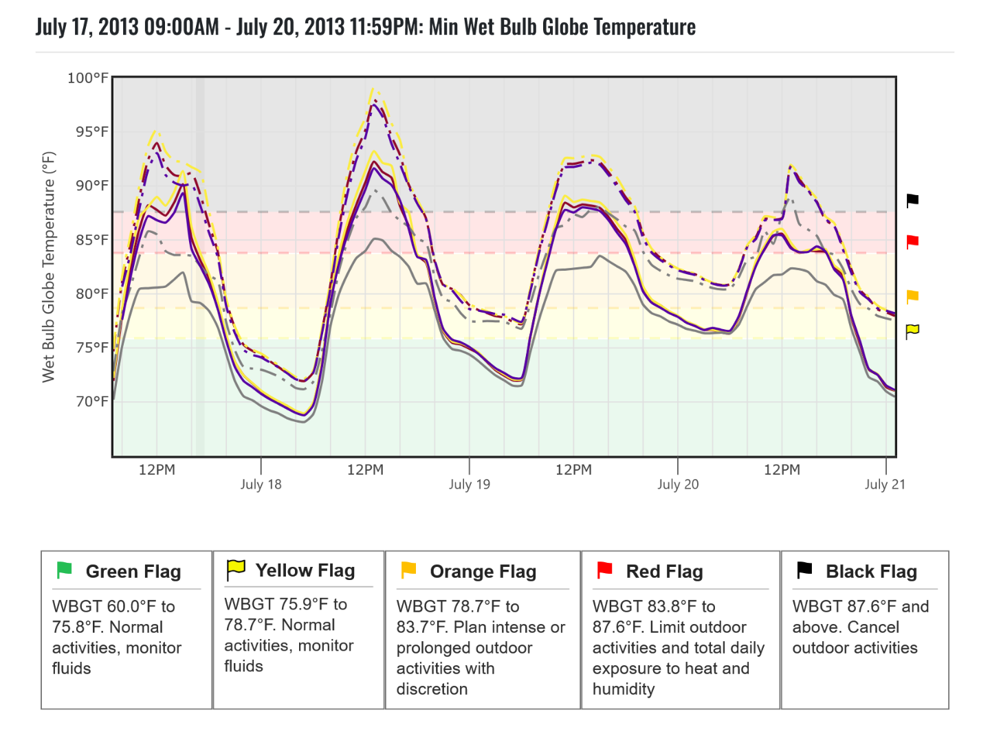
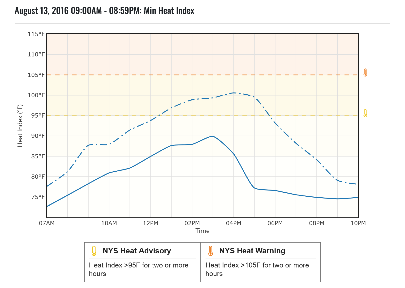
The Hourly Temperature Graphs tab can display the 8-day Statewide Heat Event at 30-meter resolution or the 16 local events generated for Niagara Falls. A local event is included when the full city crosses a heat event threshold at some point in the 2050s replay, whether it is a single-day NYS Heat Advisory or a multi-day National Heat Advisory. For each event hour, the historical simulation and 2050s replay can be plotted for minimum, mean, and maximum values. Sorting by maximum heat index identifies August 13, 2016, as the hottest historical event.
The maximum heat index within the city increases from 102.74°F in the historical simulation to 113.09°F in the 2050s replay. The hotter climate also pushes the 95°F heat-index threshold 2 hours earlier and keeps the heat index above 90°F until after sunset; historically, temperatures were already falling below 90°F by 5 PM.
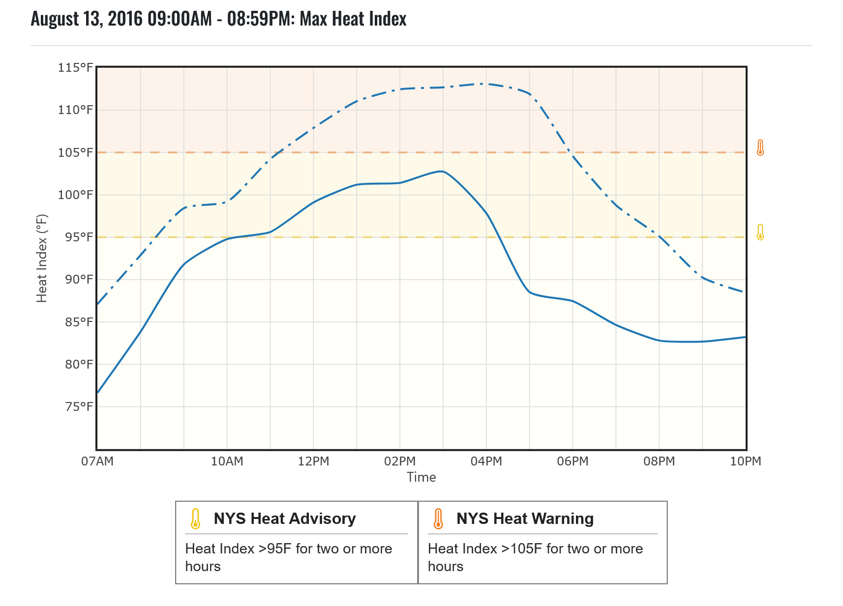

The minimum heat index increases by up to 10.7°F at the maximum hour, meaning the entire city reaches at least NYS Heat Advisory conditions. At individual hours, differences reach up to 22°F: where the historical simulation cooled citywide by 5 PM because of a cold front or precipitation, the 2050s replay retains heat farther into the evening under different moisture and weather conditions.
Conclusion
This example shows that future heat risk is much more than maximum temperatures. Niagara Falls heat event becomes more intense, longer-lasting, and more widespread when the same modeled weather is replayed under a hotter 2050s climate. The Heat Event Characteristics tab identifies shifts from single-day advisory conditions to multi-day National events, while the threshold and hourly graphs reveal information on earlier onset, hotter peak values, and less evening relief.