Tool Overview

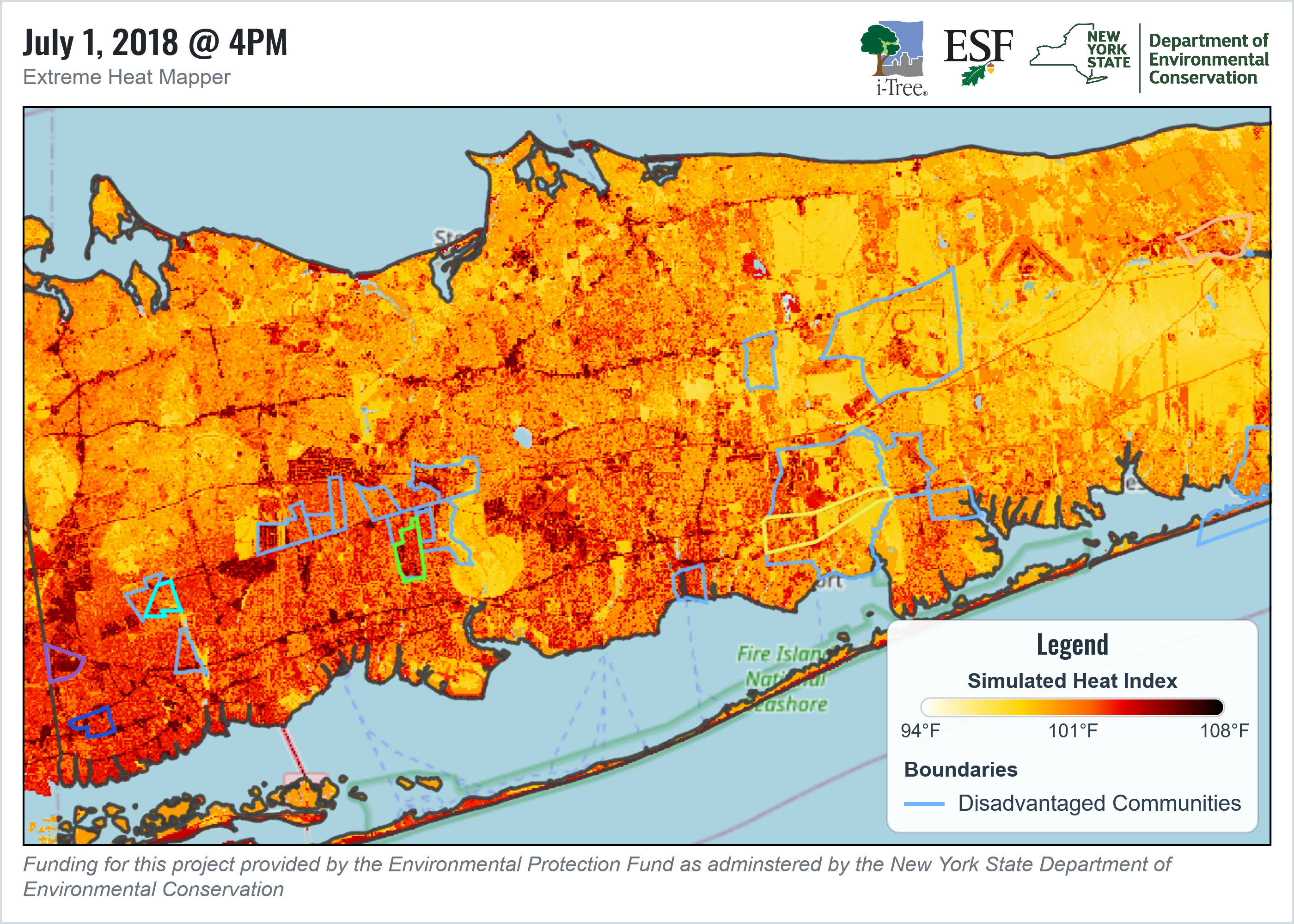
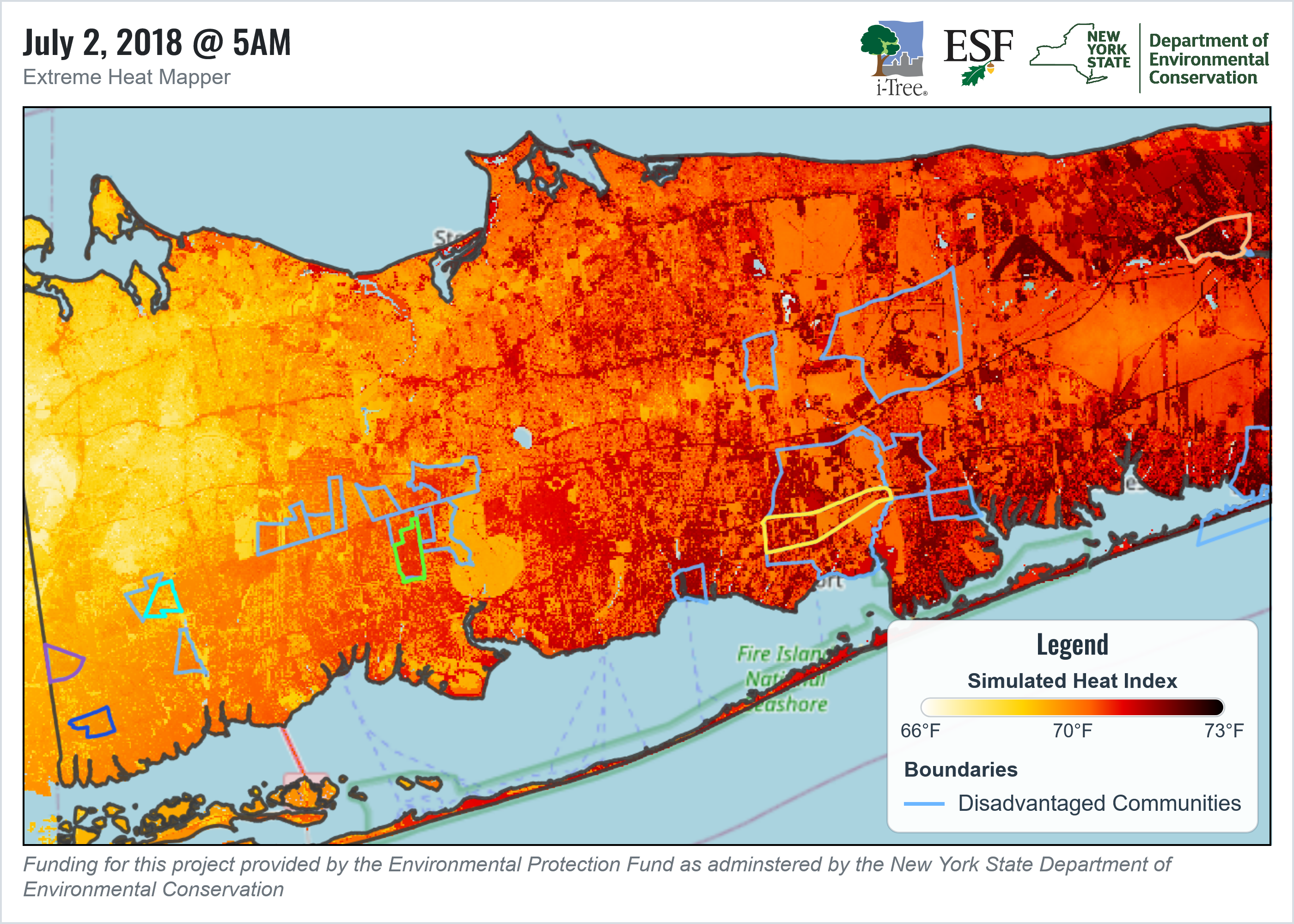
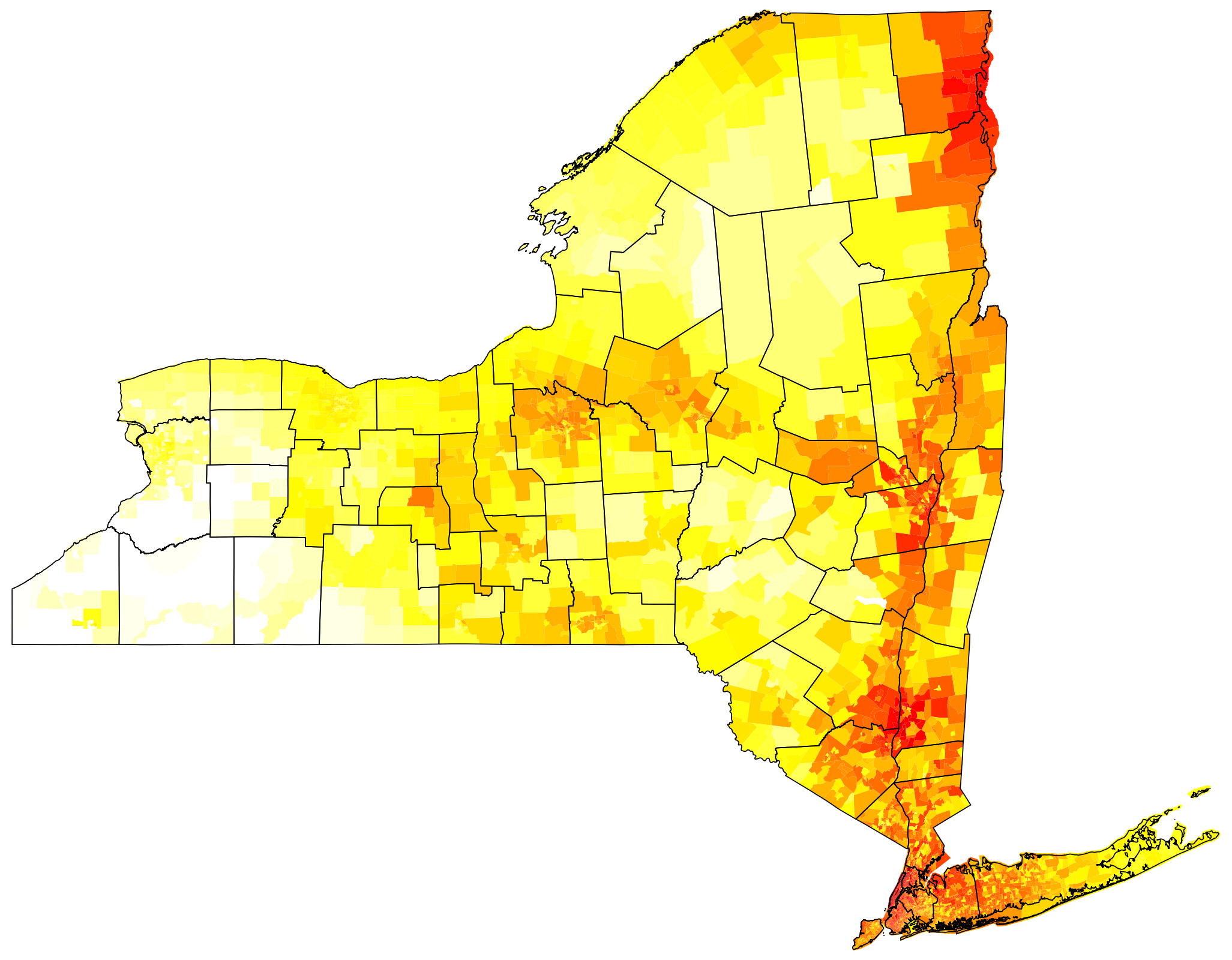
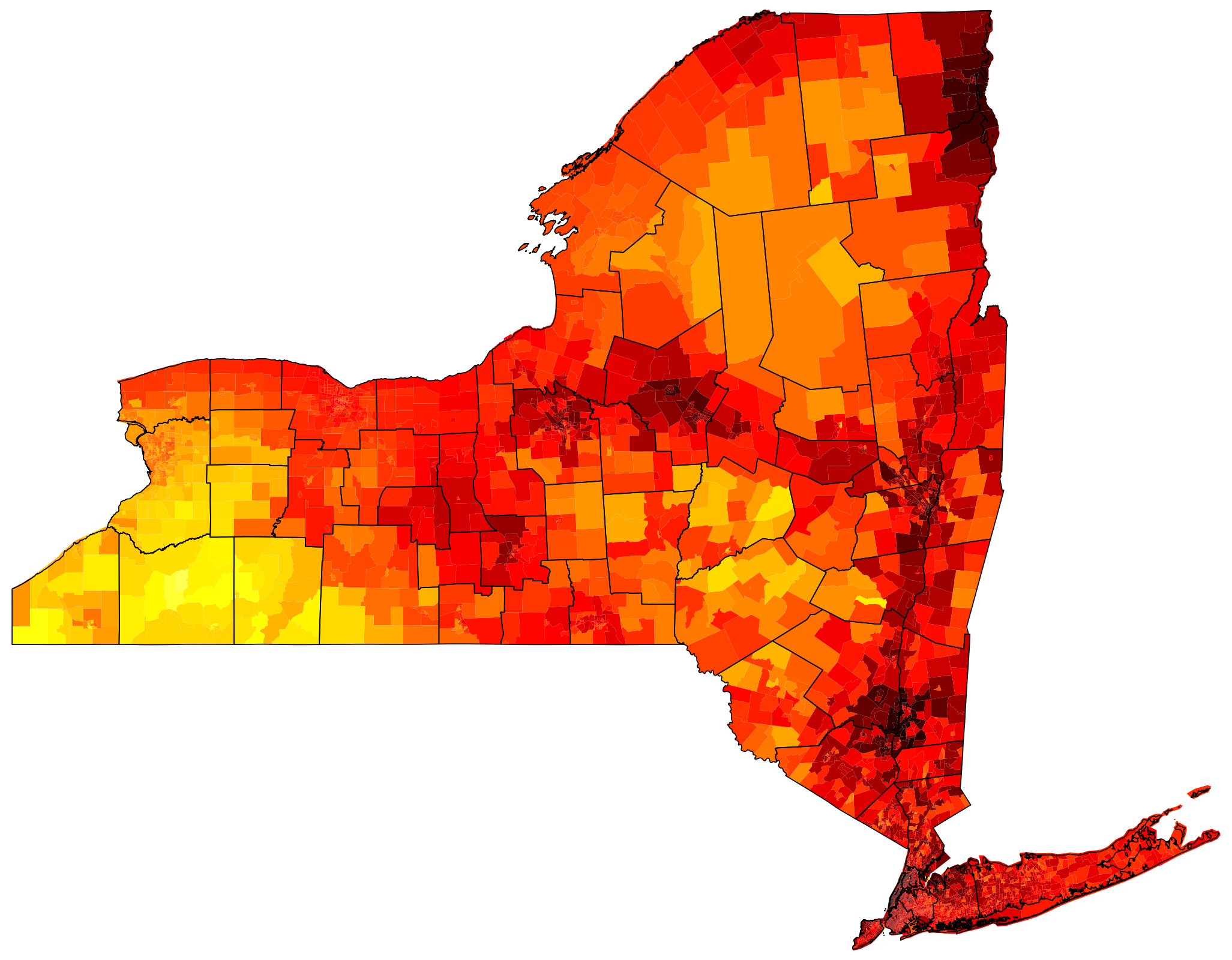
The Extreme Heat Mapper allows you to view temperature maps for select hours of heat events. These events are viewable under the historical conditions simulated at a 30-meter neighborhood-level resolution, in addition to a future projection of the same heat event set-up under a warmer future climate. To view more about the historical and future weather inputs, see About the Thermodynamic Global Warming (TGW) Dataset.

The temperature maps are the outputs of simulations from the i-Tree Cool Air model. This spatial model resolves for water and energy balances utilizing raster inputs of land use, tree and impervious cover percentage, elevation, and anthropogenic heat. For more information on the i-Tree Cool Air model, see the i-Tree Cool Air Model Methods.

The 2018 heat event was selected for high-resolution simulation because of the long duration and high temperatures experienced across the entire state. To view temperatures across more heat events, use the Heat Trends Explorer.

The future simulation under a warmer climate provides a perspective on potential increases in extreme heat intensity, geographic scope, and duration, with previously non-extreme conditions crossing new thresholds to be considered extreme by today's standards. These simulations are not intended to estimate future changes in extreme event frequency that might result from changes in large-scale atmospheric dynamics or to be verified to historical surface observations.

How to Use the Tool

Location

Begin by clicking to select areas on the map to serve as your map boundaries. This will limit the temperature map and selectable layers (i.e census tracts) to only the boundaries you select.

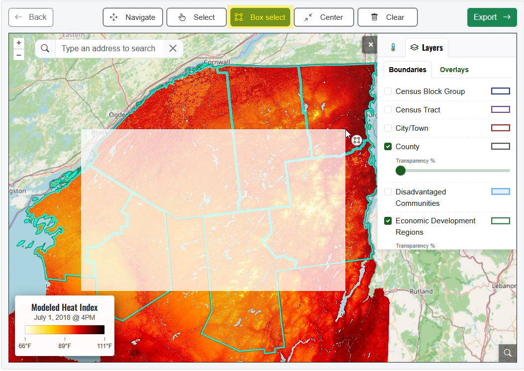
Use Identify to click on a boundary and view detailed statistics for the area. Box Select allows you to click and drag to add selections.

Once you have selected your areas of interest, click Continue to move to the results tab.

Timeframe

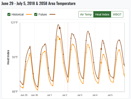
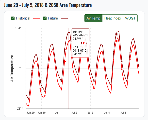
On the timeframe tab, an area-averaged graph of the average maximum temperature over the selected bounds will be displayed. The top controls will adjust the temperature type and decades shown.

Select a marked hour from the map or select a pre-calculated hour from the Auto-selector. Once an hour is selected, you may continue to the next map.

Map

Once the map is loaded, there are multiple components to interact with:

Maps and Layers

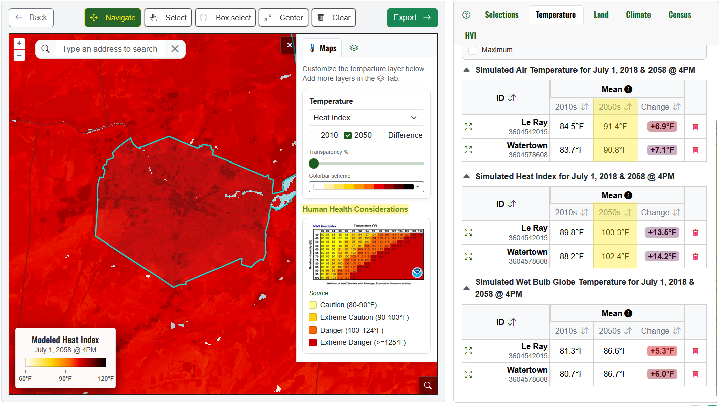
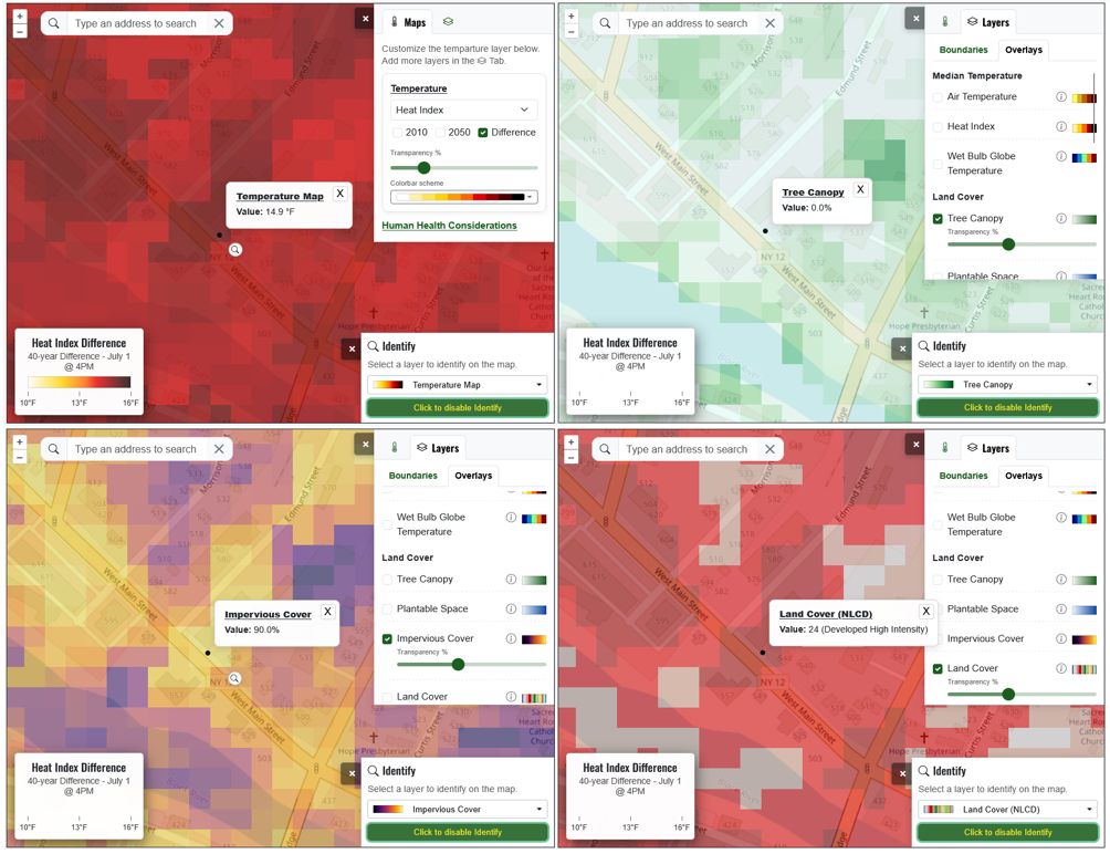
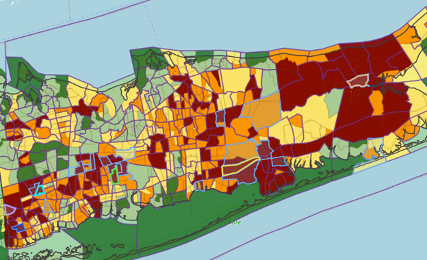
Interact with visible map layers using the top-right map pane. All layers can be adjusted for transparency, and colorbar appearance can be adjusted for the temperature map. Boundaries can be overlaid to select layers for further analysis or map export, and overlays can be used to identify areas by demographics, heat vulnerability, or land use info.

Air Temperature: Heat Index: Wet Bulb Globe Temperature:
Fahrenheit temperature simulated at a 6-foot height a measure of how hot it feels when relative humidity is combined with the air temperature a measure of heat stress in direct sunlight that accounts for temperature, humidity, wind speed, sun angle, and cloud cover.

Map Tools

Click on a tool button above the map to activate it. An enabled tool will be highlighted in green, and you must click on the tool button again to disable the tool.

Navigate allows for the default panning and zooming of the map area.

Select a boundary by clicking on it. The boundary can be un-selected by clicking the same area on the map again. Map pan is disabled when Select is active.

Box-select to add multiple boundaries at once by clicking and dragging on the map. Ctrl + click and drag to unselect areas. Map pan is disabled when Box-select is active.

Center centers the map view on area selections if available, otherwise it zooms to the full map area.

Clear selection clears all current selections.

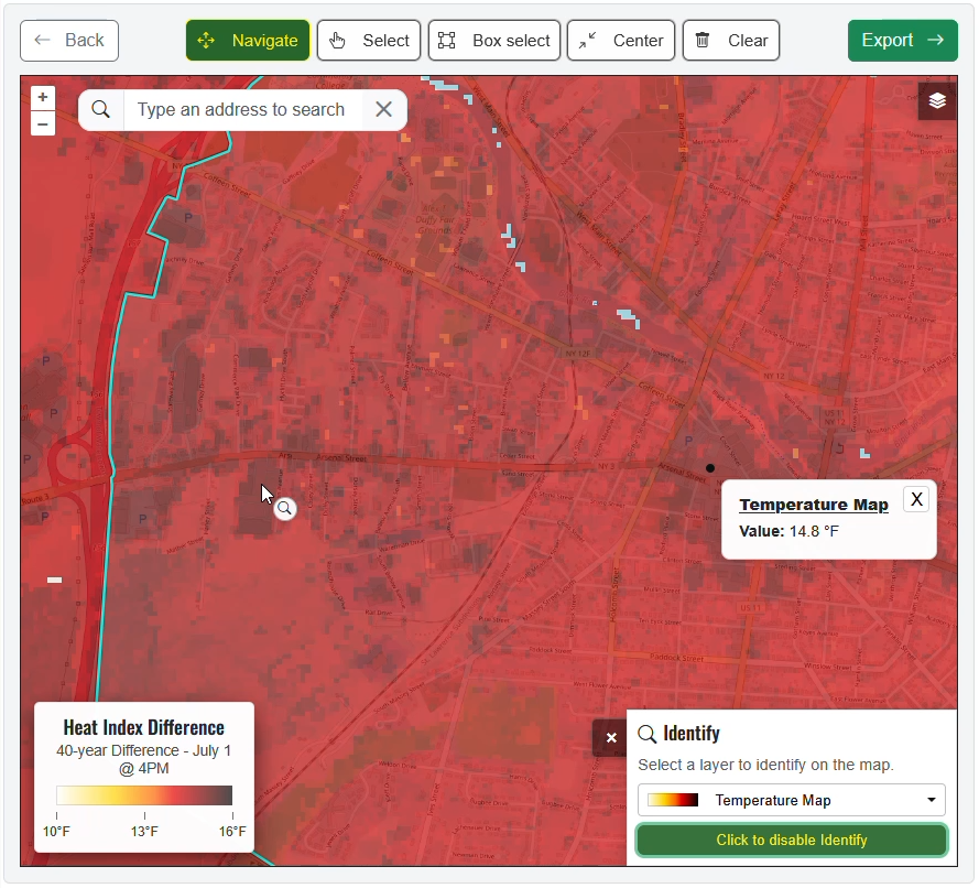
Identify areas using the bottom-right map icon . With the tool active, click the map to view the pixel value or details on the boundary statistics.

Customize, Import, and Export Selections

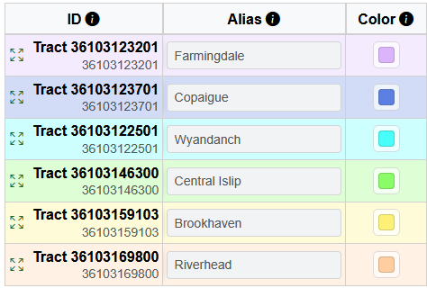
After adding selections, in the Edit tab the Edit button opens the table to allow custom color and name assignments. This is particularly useful when comparing multiple tracts and block groups in a small area. You can select Tint table rows with selection colors to change each table’s color to coincide with the assignment.

Export the .uhim file for later use and import it from the Location tab area selection panel.

Getting Started

Not sure where to start? Follow the steps below:

  1. Select a Temperature map from Maps, and toggle through maps with the checkboxes. A transparency of 20-50% is best for viewing the base map underneath without losing heat details. You can change the colorbar scheme using the dropdown menu.
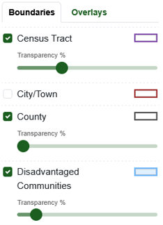
  2. In the Layers tab, you can add Census Block Groups or Census Tracts to interact with smaller areas. City/Town and County offer larger geographies.
  3. Use the overlays tab to look at land use, demographic, and heat sensitivity overlays. If you are having trouble viewing these layers, you can hide the temperature map by clicking the active checkbox in the Maps tab.
  4. Identify pixel values or boundary details by clicking on the bottom-right corner of the map. Select a visible layer from the drop-down, and click the button below to enable the tool. Disable the tool by re-clicking the button or pressing ESC on your keyboard.
  5. You can select areas using the top map controls. This will populate tables of census, land use, and temperature data for analysis between areas. The edit table can be used to assign street/neighborhood names to block groups and tracts, and separate layers by color. Here you can also export the current selection for later reload.
  6. In the Export tab, you can adjust the appearance of an output map. Additional image downloads are available on this page for each table. CSV downloads are also available for the table data, and the map can be exported into a .TIF from the viewport.

Export

Map Area

  1. Map extents - controls what the map shows
    1. Current view - approximation of current viewport in Map
    2. Selected areas only - focus on selected layers from the map if applicable; otherwise, center on the map area selected in Location
  2. Map Type - delivery format for the temperature map
    1. .PNG - export image of the Map Preview; adjusted by options on this page
    2. .TIF - geospatial format of the temperature map for GIS or further analysis
  3. Boundaries - Check or uncheck layers that were loaded in Map to display them in the map view export
  4. Overlays - Check or uncheck layers that were loaded in Map to display them in the map view export. If you want to only show overlays, turn off the temperature map in Map
  5. Legend
    1. Title - shows title 'Legend' with legend box
    2. Other layers will populate based on layers loaded in Map.
  6. Map Details - enables a separate legend box with a north arrow and scale bar

Page Layout

  1. Legend Placement - corner to place legend with drawn map items (i.e. temperature map, boundaries)
  2. Map Details Placement - corner to place legend with north arrow and scale bar
  3. Orientation - page style

Table Formats

  1. Tables -
    1. Census: Total Population, % Disadvantaged Community, % POC, % Poverty, % Disabled, % Elderly, % No HS Diploma
    2. Climate: Average Maximum Temperature (June-September average), Heat Event Days
    3. Land: Impervious %, Tree Cover %, Plantable Space %
    4. HVI:
      1. Non-NYC: Broken down into exposure, sociodemographic, and health outcome percentiles; with additional tables for detailed breakdowns of each category
      2. NYC: Median household income, home AC availability, % Black/AA
    5. Temperature:
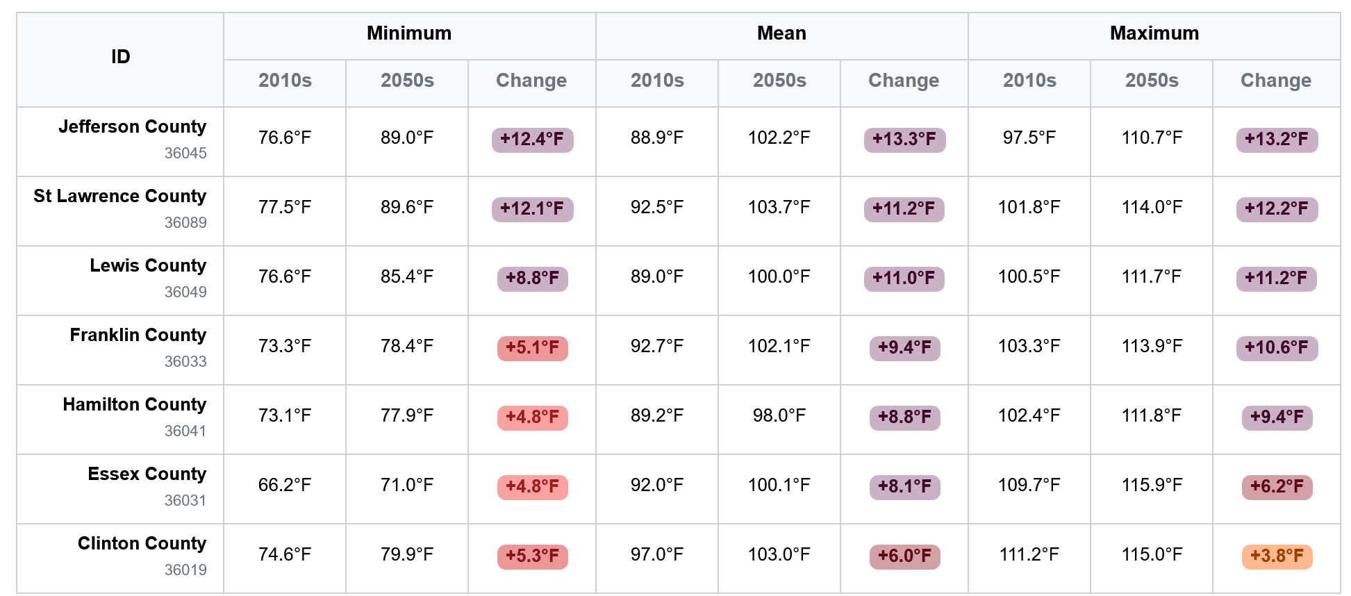
      1. Table of minimum, mean, and maximum temperatures for the mapped hour.
  2. Format:
    1. Save as image: saves selected tables as images
    2. Save as CSV: save selected tables as CSVs to interact with data further
  3. Use custom colors on table: Tints table PNGs with selected area colors

Examples

Example 1

Heat Across a City

This example shows how the Extreme Heat Mapper can be used to compare heat conditions across different types of urban and suburban areas during the same simulated heat event. By selecting places such as downtown, a hospital, an airport, a park, and suburbs with different tree-cover levels, we can see how heat varies across the city and how those patterns relate to land cover, population, and heat vulnerability.

This approach can be applied by selecting local areas of interest, comparing land cover and demographic characteristics, and then reviewing hourly and 10-year heat metrics together. The results can help identify where heat interventions may be most urgent, where green infrastructure may be feasible, and where local heat conditions may differ from the weather-station data commonly used for public warnings.

Select the map bounds

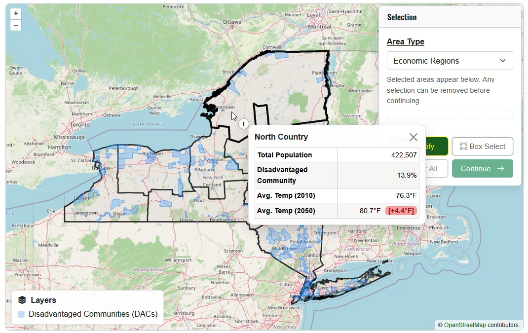
In the Location tab, select the county containing the city of interest.
In the Timeframe tab, “Hottest hour” is selected by default. After areas are selected, the hour can be adjusted.
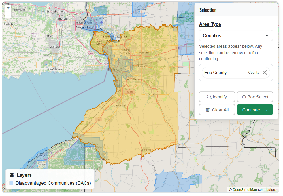
Location tab with Erie County selected.
Area Type is set to Counties; Erie County is highlighted in orange after clicking on the map.

Set up the map view

After the map loads, open the Layers tab in the upper-right map pane and select Census Block Groups or Census Tracts to show smaller boundaries.
Use Select at the top of the map to add areas by clicking them.
Increase the temperature-map transparency to see the basemap and more easily select areas near hospitals, parks, or other landmarks.
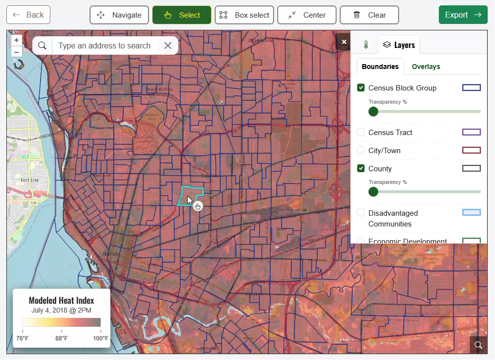
Temperature map with block groups selected and map select active.
Temperature map with transparency increased. Block Groups are selected from the Boundaries options, and the select tool is active from the top panel to click and select areas in cyan.

Select areas across a city

The selected areas include an airport, downtown, a hospital, a park, a high-tree-cover suburb, and a low-tree-cover suburb. Other useful comparison areas may include commercial zones, construction areas with outdoor workers, or agricultural land.

After selecting the areas, assign each area a color and alias so the table and map are easier to read. Save the changes, then export the selections as a .uhim file so the same areas and custom appearances can be imported later. Turn on tinted table rows to distinguish area types more easily.
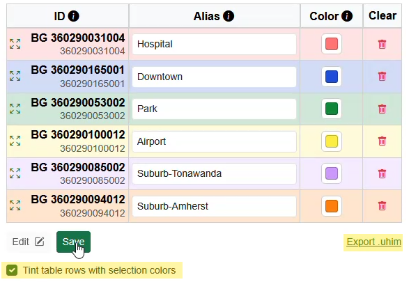
Selections table with custom colors and nicknames.
Tables from the Selections tab showing the selected layer ID, nickname assigned to each layer, and updated colors. This view is from after the button is triggered. To save changes, the hovered-over Save button must be clicked. To revisit the project later, Export .uhim is highlighted. It is highly recommended to tint table rows with selection colors for easy differentiation of selected areas.

Compare Area Characteristics

The Land, Census, and Heat Vulnerability Index (HVI) tabs summarize each area’s population, land cover, and heat vulnerability.

Land Cover

The Land tab summarizes land-cover data for each selected area. Key patterns include:

  1. Tree cover is highest in the high-tree-cover suburb, followed by the park.
  2. Impervious cover is highest downtown, followed by the hospital and the low-tree-cover suburb.
  3. Plantable space is estimated by subtracting tree cover and impervious cover from total land area. It is highest in the park, airport, and high-tree-cover suburb, where grass and other open land are more common.

Areas with low tree cover and high plantable space may be good candidates for green infrastructure or other heat interventions, depending on their heat exposure and population characteristics.
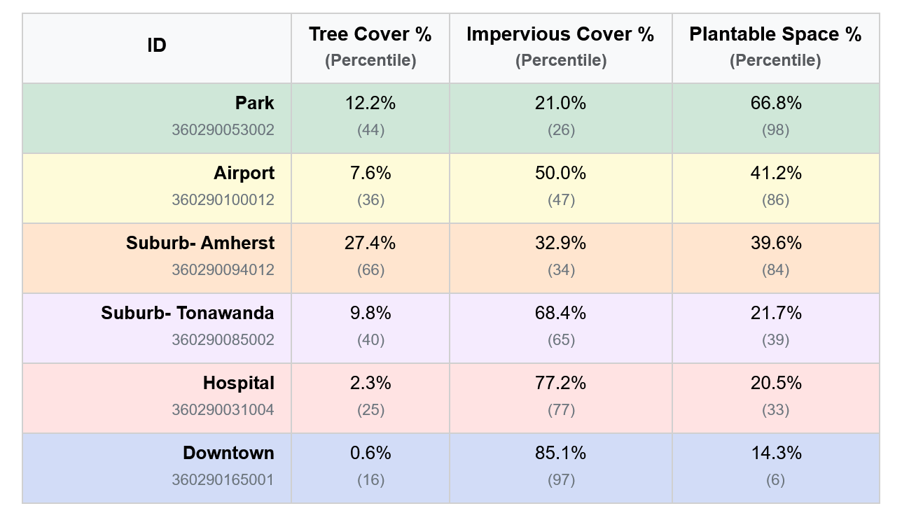
Land cover table sorted by plantable space.
Land cover table, sorted by plantable space.
Census Data

The Census tab shows population characteristics for each selection and helps identify where people, especially vulnerable groups, are concentrated. This context helps target interventions to high-impact areas. In this example:

  1. Disadvantaged communities are concentrated downtown and near the hospital.
  2. The park and airport areas have lower incomes and higher percentages of people of color, which may be associated with greater outdoor heat exposure. However, these areas have smaller older adult and disabled populations, two groups with higher susceptibility to heat stress.
  3. The largest population concentrations are downtown, in the low-tree-cover suburb, and in the airport block group.

These population and demographic indicators show who may be affected by an extreme heat event and how many people are exposed.
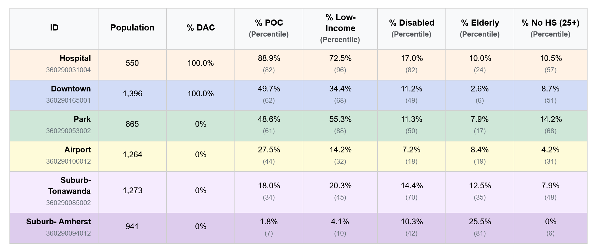
Census table sorted by percent people of color.
Census table, sorted by % POC.
Heat Vulnerability Index

The HVI tab combines statewide heat, population, and health-outcome indicators into a broader heat-risk profile. In this example:

The HVI ranks the suburbs highest for heat exposure, largely because of the increase in days above 85°F heat index from 2000 to 2021. Heat index combines air temperature and humidity to estimate how hot conditions feel to the human body.

Sociodemographic vulnerability is highest near the hospital and downtown, largely because of heat risk among the Black/African American population.
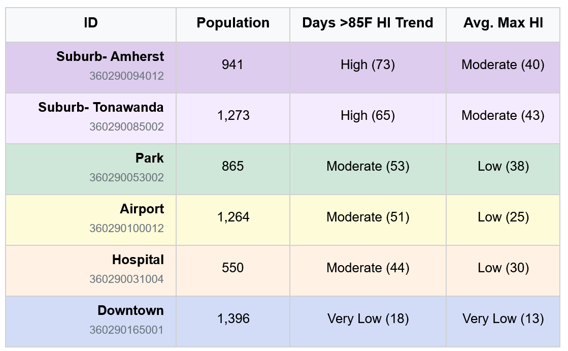
HVI exposure table sorted by days above 85 degrees Fahrenheit heat index percentile.
HVI Exposure table sorted by Days >85°F Heat Index percentile; measured from 2000-2021.

Health-outcome susceptibility is highest near the hospital, driven in part by the highest kidney-failure hospitalization rate in the statewide non-NYC dataset.

Together, these indicators give the hospital area the highest overall Heat Vulnerability Index ranking, followed by the downtown and suburban areas.
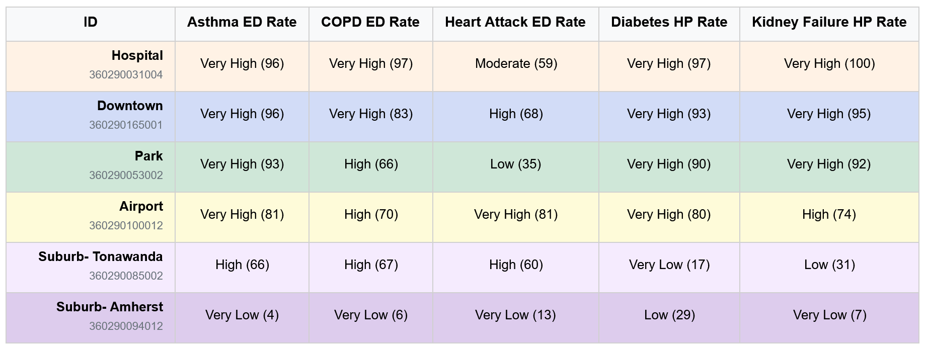
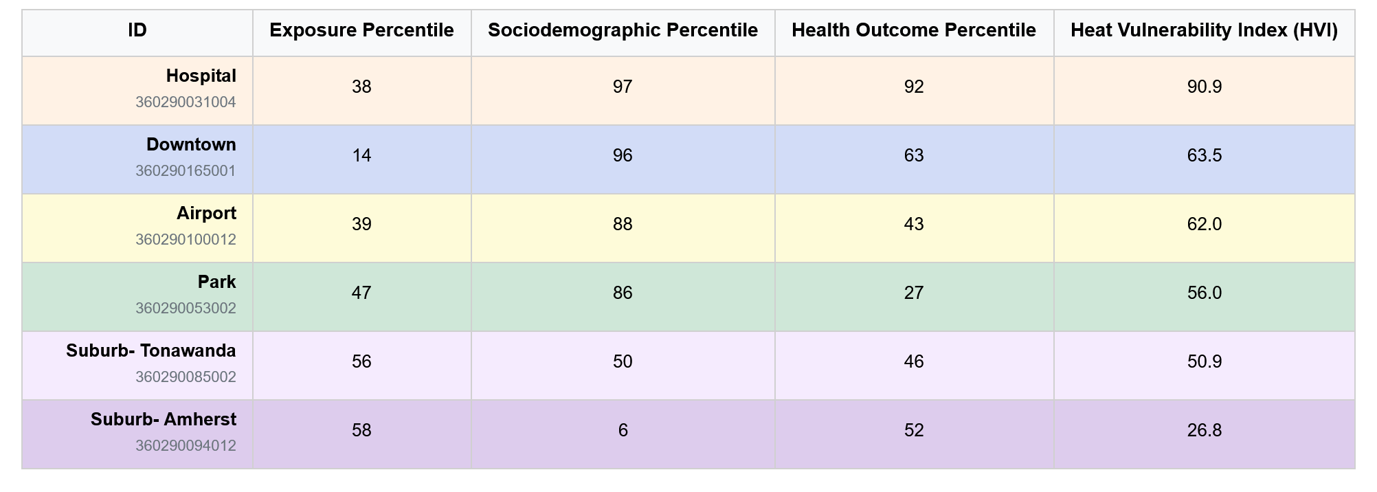
Health outcomes table with emergency department visits and hospitalizations.
ED = emergency department visits; HP = hospitalizations.
Main HVI table ranking selected areas.

Compare Heat

With the population and land-cover context in place, compare urban heat patterns during a simulated extreme heat event and examine how that same event changes in the 2050s replay. In the Extreme Heat Mapper, “historical” means a calibrated climate-model recreation of a past weather event, not direct observations. “Future” means that same recreated event is replayed under a hotter 2050s climate, with climate-forced changes in temperature, moisture, and related weather fields. It is not an independent climate projection that creates its own weather sequence. Both the historical recreation and 2050s replay are then processed through the i-Tree Cool Air temperature model, which accounts for tree canopy, impervious surface, other land cover, elevation, anthropogenic heat, and related local factors to produce the spatial temperature maps and tables shown in the tool. Results can be explored as hourly values for a single event and as 10-year average summaries.

The Temperature tab reports statistics for the hour shown on the map: the maximum value within the selected area (the hottest pixel), the mean across all pixels in the area, and the minimum value.
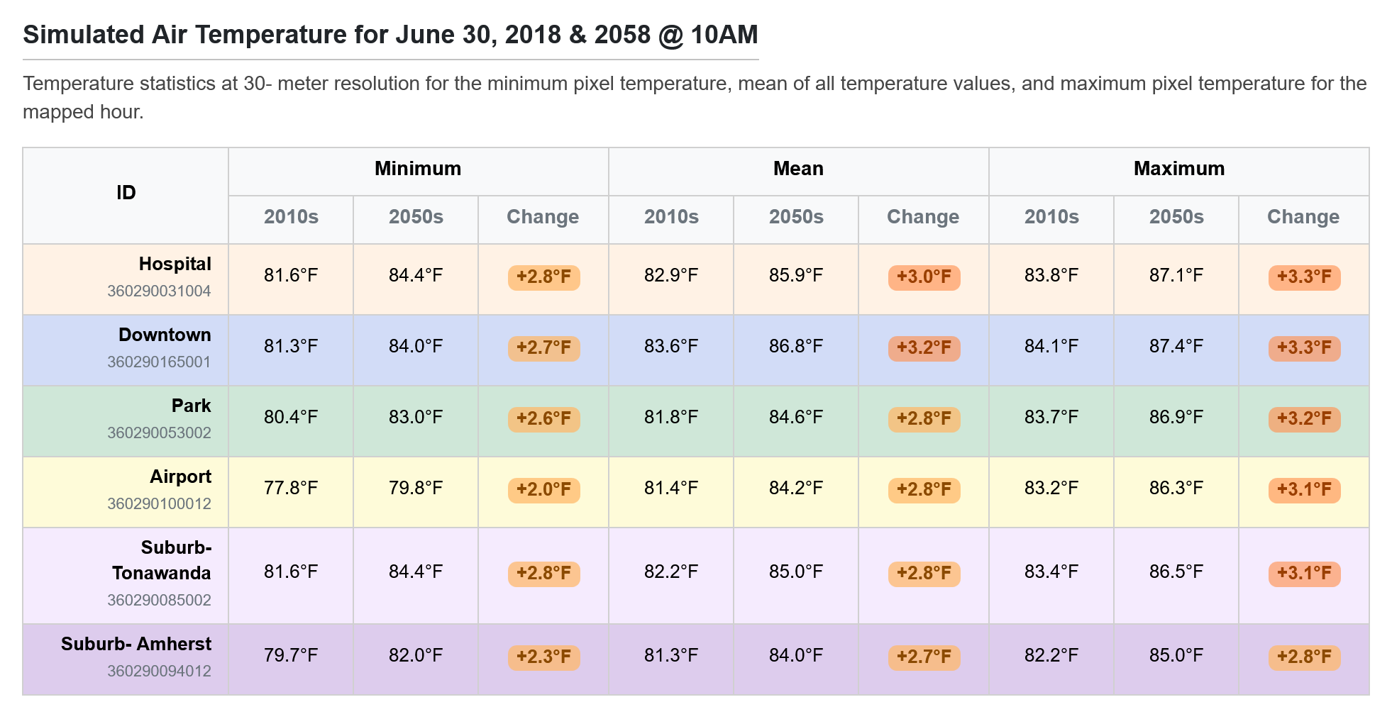
Temperature table for selected areas.

Sorting by air temperature shows that the highest maximum values occur downtown, at the airport, and near the hospital. These same areas remain among the hottest in the 2050s replay. For this hour, however, the largest increases occur downtown for maximum and mean temperature and in the low-tree-cover suburb for minimum temperature.

Although maximum temperatures in the hottest areas are close to one another, about 0.5°F apart, mean temperature better summarizes conditions across each full area. Downtown’s mean temperature is more than 1°F higher than the suburban areas.

High minimum temperatures indicate areas with little green space and mostly residential or urban development. Because downtown includes a park, the highest minimum temperatures occur in the low-tree-cover suburb and near the hospital. Tonawanda, the low-tree-cover suburb, also has the largest increase in minimum temperature.

Repeat this process for the heat index and wet bulb globe temperature tables. WBGT combines air temperature, humidity, wind, and solar radiation to estimate heat stress. Sorting each statistic and decade helps compare extreme and average heat conditions during the event.


The Climate tab summarizes the 300-meter, 10-year i-Tree Cool Air simulations for 2010-2019 and 2050-2059 using the thermodynamic global warming dataset. These 10-year summaries are separate from the 30-meter maps, which show a single simulated heat event.

The first table reports the average maximum heat metric from June through September over each 10-year period. It loads with Heat Index selected by default. The largest average heat-index increases occur in the suburbs, where lawns and limited shade can compound heat stress. However, these suburbs still have lower absolute heat-index values than the other compared areas.
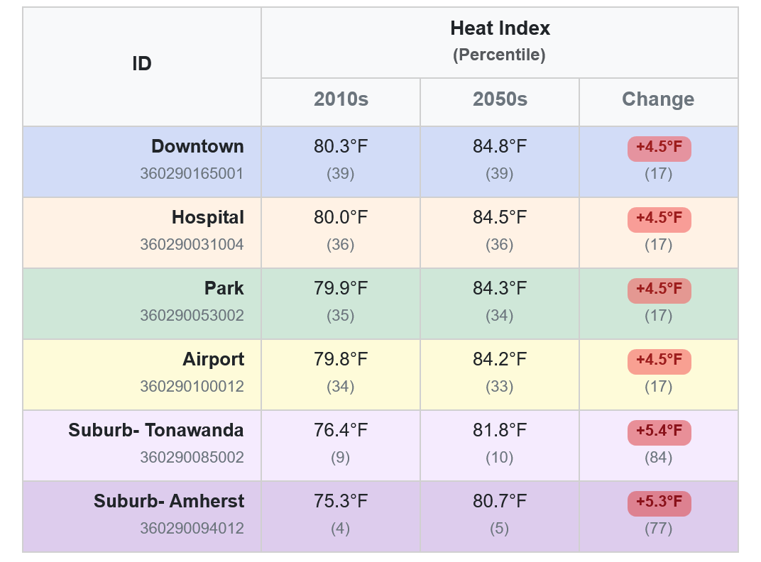
Climate table comparing median maximum air temperature for 2010s and 2050s.
Median Maximum Air Temperature for 2010-2019 and 2050-2059.

The Heat Advisories & Warnings section summarizes how often high-heat conditions occur. For New York State heat events, defined here as heat index above 95°F for at least two hours, downtown, the hospital, and the park each have at least one event when the airport does not meet the same threshold. This matters because heat advisories are often based on airport weather-station readings, which can be cooler than nearby urban areas because of the urban heat island effect.
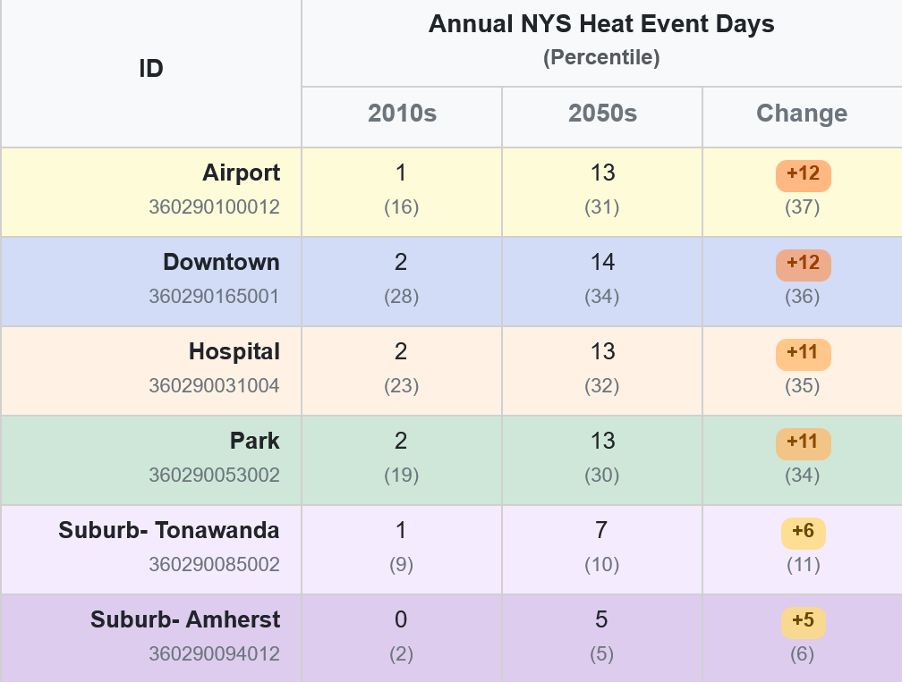
Climate event table showing annual average of days above 95 degrees Fahrenheit heat index for two or more hours.
Annual Average of Days >95°F Heat Index for 2+ hours.

Export Map

The table review suggests three main findings:

  1. The hospital and downtown areas have the highest heat vulnerability and are also disadvantaged communities, making them high priorities for heat interventions. Lower plantable space, however, may limit some green-infrastructure options.
  2. The suburbs have lower overall heat vulnerability, but heat increases faster there in the 2050s replay. Their larger older adult and disabled populations may also increase heat risk.
  3. Some urban areas are hotter than the airport where heat events are often measured. Local high-heat conditions may therefore occur even when airport-based thresholds are not reached.

The selected areas and tables can be exported together to share findings. Center the selected areas in the frame as much as possible and leave room in one corner for the legend before moving to the Export tab. In the Export tab, add a legend that includes the title, temperature scale, and selected areas in the bottom-left corner. Then export the map as a PNG file.
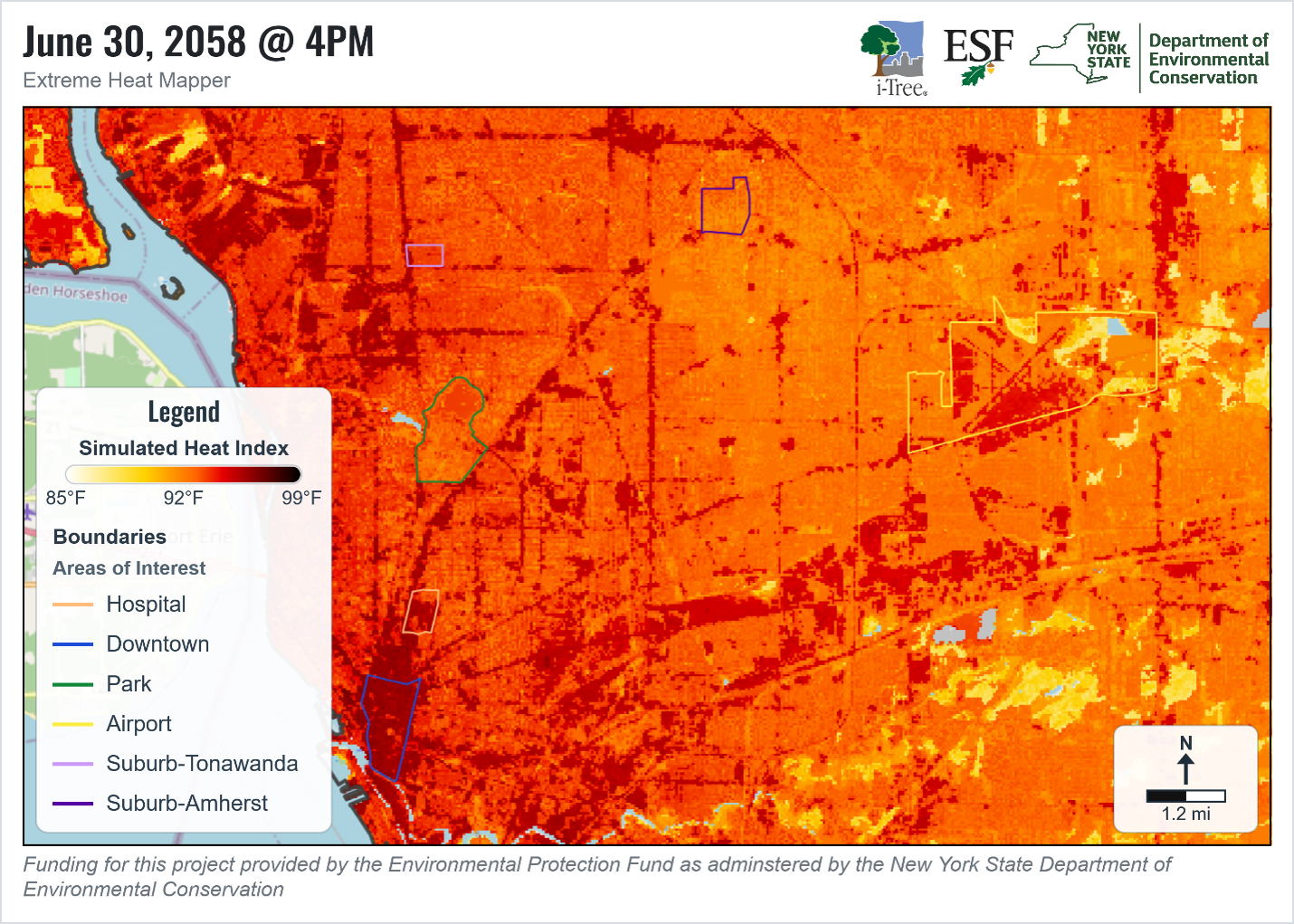
Exported map with selected areas labeled.
Exported map with labels shown for each area selection.

Conclusion

This example demonstrates that the hottest places are not always the same as the most vulnerable places. Downtown and hospital areas may have higher heat vulnerability and more disadvantaged communities, while suburban areas may show larger future increases in heat during the 2050s replay. Suburban populations may sometimes have higher rates of disabled or elderly individuals; living alone further increases risk. The example also illustrates that airport-based heat measurements may not fully represent nearby urban conditions, since city areas can exceed heat-event thresholds even when the airport does not.
Data

Simulations

The i-Tree Cool Air model (revision 1946) was simulated for June 30 through July 5, 2018 and the corresponding 2058 future scenario at 30-meter resolution. The simulations use 2019 land cover, tree canopy, and impervious cover inputs from the National Land Cover Database (NLCD). Elevation, in centimeters, was retrieved from the National Hydrography Dataset Plus V2 (NHDPlusV2). Simulations are divided by HUC10 watersheds to calibrate initial soil moisture and watershed discharge for each period.

Anthropogenic heat, or thermal energy released into the atmosphere from human activities, is represented using a 1-kilometer hourly anthropogenic heat flux dataset. Link The dataset provides anthropogenic heat emissions in W/m2 for each hour of the day across each month. The anthropogenic heat grids are separated into commercial+residential emissions and transportation emissions. These components are resampled from 1-kilometer to 30-meter grid cells using impervious cover and urban land use distribution.

Simulations produce air temperature, heat index, and wet bulb globe temperature outputs as ASCII files that are merged from watershed outputs to statewide maps. Water cells are excluded from the temperature maps and subsequent census-level analysis.

Map

Boundaries

Census Block Group: Administrative boundary data displaying the 2020 block group boundaries. Block groups are clusters of blocks within the same census tract and generally contain between 600 and 3,000 people. Link

Census Tract: Administrative boundary data displaying the 2020 census tract boundaries. Census tracts are subdivisions of United States counties and generally contain between 1,200 and 8,000 people, with an optimum size of about 4,000 people. Link

City/Town:

  • Non-NYC: Administrative boundary data displaying the 2020 county subdivision boundaries clipped to the shorelines of major hydrographic features. Census county subdivisions are divisions of counties, including Minor Civil Divisions (MCDs) and Census County Divisions (CCDs). Link
  • NYC: Administrative boundary data displaying the 2020 Neighborhood Tabulation Areas (NTAs). NTAs are created by aggregating census tracts within Community District Tabulation Areas (CDTAs). Link

County: Administrative boundary displaying the 2020 county boundaries clipped to the shorelines of major hydrographic features. Counties are the primary legal, administrative, and statistical subdivisions of a state. Link

Disadvantaged Communities: Administrative census tract-level boundary displaying disadvantaged communities (DACs) defined by the New York State Energy Research and Development Authority (NYSERDA). DACs are underserved communities identified as priority areas in planning and programs for state climate initiatives. Link

Economic Development Regions: Administrative boundary delineating New York into 10 separate regions based on shared economic interests, geography, and labor market. The Regional Economic Development Councils (REDCs) drive local, bottom-up economic growth and direct state investments. Link

State: Administrative boundary displaying the 2020 New York State boundaries clipped to the shorelines of major hydrographic features. Link

Overlays

Land Cover

Tree Canopy: Tree canopy raster from the 2019 National Land Cover Database (NLCD) at 30-meter resolution, produced by the Forest Service as a partner in the Multi-Resolution Land Characteristics Consortium (MRLC). This layer represents the percentage of each cell occupied by tree canopy. Link

Plantable Space: Estimated percentage of each cell that is not occupied by tree canopy or impervious cover. It is calculated as 100% minus tree canopy cover minus impervious cover. Because NLCD tree canopy cover can underestimate existing canopy, this value may overestimate available planting space. Plantable space should therefore be interpreted as a screening-level indicator of potential planting opportunity rather than a field-verified estimate of plantable land. Supporting references: Nowak and Greenfield 2010 Link; Greenfield and Schleeweis 2019 Link

Impervious Cover: Impervious cover raster from the 2019 National Land Cover Database (NLCD) at 30-meter resolution, produced by the U.S. Geological Survey (USGS) Land Cover program. Link

Land Cover: Land cover raster from the 2019 National Land Cover Database (NLCD) at 30-meter resolution, produced by the U.S. Geological Survey (USGS) Land Cover program. It classifies land into categories including urbanization, forest, agriculture, grasslands, and wetlands. Link

Community

% POC: Percent of the total population that is Hispanic or non-white, calculated at the block group level. Link

% Low-Income: Percent of the total population below 200% of the 2022 poverty level. Poverty threshold source: Link ACS table source: Link

% Disabled: Percent of the total population with one or more disabilities, calculated at the census tract level. Link

% Elderly: Percent of the total population over age 64, calculated at the block group level. Link

Heat Vulnerability Index (NY): Percentile score from 0-100 defined on a statewide, non-NYC census tract scale. The index reflects how vulnerable a Census Tract’s population is to heat based on social and demographic attributes, overall disease burden, and presence of high temperatures. Link forthcoming.

Heat Vulnerability Index (NYC): Score from 1-5 defined for Neighborhood Tabulation Areas (NTAs) in New York City. The index weighs air conditioning and green space access, median income, and Black/African American population. Link

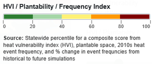
HVI / Plantability / Frequency Index: Custom index developed for the purpose of this product meant to highlight areas of high heat vulnerability index, high plantability [for green infrastructure interventions], number of future heat events (>95F heat index), and % change in heat events between 2010 and 2050. This is meant to be a preliminary product highlighting areas for potential heat intervention.

This index ranks the sums of:
a) Heat Vulnerability Index 0-100 (NYC value [1-5] multiplied by 20)
b) Plantable Space 0-100; based on % value of available space
c) Sum of heat events from 2050-2059; normalized to a statewide percentile from 0-100.
d) Change in heat events from 2010-2019 to 2050-2059; converted from a percentage (i.e. 25% increase, 110% increase) to a statewide percentile

Base Map

Map data copyrighted OpenStreetMap contributors and available from OpenStreetMap. Link

Tables

Temperature

Temperature statistics describe the minimum pixel temperature, mean of all temperature values, maximum pixel temperature, and modeled change for the selected hour.

Minimum: Lowest pixel value among all temperature cells in the boundary.

Mean: Average of all temperature pixel values in the boundary.

Maximum: Highest pixel value among all temperature cells in the boundary.

Change: Temperature difference between the 2050s simulation and the 2010s simulation.

Land

Average values of land use characteristics from the 2019 National Land Cover Database (NLCD) used in model simulations.

Tree Cover %: Average tree cover percentage from 2019 NLCD Tree Canopy Cover. Link

Impervious Cover %: Average impervious cover percentage from 2019 NLCD Impervious Cover. Link

Plantable Space %: Estimated space remaining after subtracting tree canopy cover and impervious cover from total land area. This value is best interpreted as a screening-level estimate of potential planting opportunity. Tree canopy source: Link Impervious cover source: Link

Climate

Statistics from the 300-meter 2010-2019 and 2050-2059 simulations examining differences in heat between decades.

Average Maximum Temperature
Air Temperature Heat Index Wet Bulb Globe Temperature
50th percentile of daily maximum air temperature from June through September for the simulated decade. 50th percentile of daily maximum heat index from June through September for the simulated decade. 50th percentile of daily maximum wet bulb globe temperature from June through September for the simulated decade.
Heat Advisories and Warnings
Annual NYS Heat Event Days Total National Event Days
Average yearly number of days in the simulated decade where the maximum heat index is greater than 95F for two or more hours. To read more about event calculations, see the Heat Trends About page.
Because this value is calculated from maximum heat index, a tract, city or county inherits an event any time one or more block groups within it meets the threshold.
Decadal sum of events where maximum heat index is greater than 100F and nighttime air temperature is greater than 75F for at least two days. To read more about event calculations, see the Heat Trends About page.
Since this value is calculated from maximum heat index and warm overnight air temperature; a tract, city, or county inherits an event any time one or more block groups within it meets the thresholds.

Census

Statistics for population from the 2018-2022 American Community Survey. The selected statistics represent populations that may be more vulnerable or exposed to extreme heat.

All variables except disadvantaged communities (DACs) are calculated at the census block group level and summed to all other geographies. City/town populations across the state have boundaries that do not align with tracts or block groups. Each block group is assigned to the city/town boundary with which it has the largest area overlap; therefore, population statistics for these areas are estimates.

Additionally, cities such as Syracuse, Rochester, Schenectady, and Plattsburgh have small geometries that do not encompass a full census block group boundary. If the additional geometry encompasses more than 50% of the area, it is included in the city population count.

Population: Total population from ACS 2018-2022. Table DP05. Link

% Disadvantaged Community: Percent of the population identified as living in a disadvantaged community by NYSERDA. DACs are underserved communities identified as priority areas in planning and programs for state climate initiatives. This variable is calculated at the census tract scale. Link

% POC: Percent of the total population that is Hispanic or non-white.

% Low-Income: Percent of the total population with household earnings below 200% of the 2022 poverty level.

% Disabled: Percent of the total population with one or more disabilities.

% Elderly: Percent of the total population over age 64.

% No HS (25+): Percent of the total population over age 25 with no high school diploma.

Heat Vulnerability Index (non-NYC)

The 2020 Heat Vulnerability Index is available for New York Census Tracts outside of NYC. The score reflects how vulnerable a Census Tract’s population is to heat based on social and demographic attributes, overall disease burden, and presence of high temperatures.

Heat Vulnerability Index and exposure, sociodemographics, and health outcome values are displayed as a median and min-max range for larger geographies with multiple census tracts, and as a single value for census tracts and block groups.

All individual attributes for each category are visible as either a statewide percentile from 0-100 or as a raw value.

City/town populations across the state have boundaries that do not align with tracts. Each tract is assigned to the city/town boundary with which it has the largest area overlap; therefore, statistics for these areas are estimates.

Exposure Percentile: Percentile for summed exposure variables, including Average Maximum Heat Index and Trend in Number of Days Above 85F Heat Index Since 2000.

Sociodemographic Percentile: Percentile for summed sociodemographic variables, including black %, disabled %, elderly living alone %, below 200% poverty level, limited English %, outdoor workers %, and uninsured population %.

Health Outcome Percentile: Percentile for summed health outcome variables, including asthma, COPD, and acute kidney failure emergency department visits, and heart attack and diabetes hospitalizations for aggregated subcounty areas.

Heat Vulnerability Index: Heat Vulnerability Index from 0-100. This is the percentile of summed scores for exposure, sociodemographic, and health outcome variables, used to measure a census tract population's susceptibility to injury or harm during periods of hot weather.

Exposure Variables
Variable Description
Population Total population from ACS 2018-2022.
Days >85F Heat Index (HI) Trend Yearly linear trend in the number of days the heat index reaches 85F or greater since 2000.
Avg. Max Heat Index (HI) Average daily maximum heat index for all landmass census tracts in New York State, excluding New York City, between May and September for years 2012-2021.
Sociodemographic Variables
Variable Description
% Black/AA Percent of census tract population who are Black or African American Alone or in Combination with Some Other Race.
% Disabled Percent of census tract population with a disability.
% Elderly Live Alone Percent of census tract population age 65 years and older who live alone.
% Low Income Percent of census tract population living below 200% of the poverty line.
% Limited English Percent of census tract population age 5 and over who speak English less than very well.
% Outdoor Workers Percent of employed civilian workforce in agriculture, forestry, fishing and hunting, mining, or construction industries.
% Uninsured Percent of civilian non-institutionalized population without health insurance.
Health Outcome Variables

Values are displayed as a rate per 100,000 people for subcounty areas. Percentiles are a statewide ranking of all non-NYC locations.

Variable Description
Asthma Emergency Department (ED) Rate Rate of asthma ED visits per 100,000 population.
Chronic Obstructive Pulmonary Disease Emergency Department Rate (COPD ED) Rate of COPD ED visits per 100,000 population.
Heart Attack Emergency Department (ED) Rate Rate of hospitalizations for heart attacks per 100,000 population.
Diabetes Hospitalization (HP) Rate Rate of hospitalizations for diabetes per 100,000 population.
Kidney Failure Hospitalization (HP) Rate Rate of acute kidney failure ED visits per 100,000 population.

Heat Vulnerability Index (NYC)

The New York City Heat Vulnerability Index is calculated at the Neighborhood Tabulation Area (NTA) scale and ranks neighborhoods from 1-5 based on environmental and social factors associated with increased heat risk. Since the HVI variables are calculated at the neighborhood scale, variables such as green space are not shown in this tool to avoid confusion with census block group or tract estimates such as tree cover percentage. View all HVI variables from the source. Link

Air Conditioning: Percent of adults reporting that they have an air conditioner. Citywide median is 91%.

Median Income: Median household income at the neighborhood scale. Citywide median is $67,046.

Black Population %: Percent of population identifying as Black or African American Alone or in Combination with Some Other Race.

Heat Vulnerability Index (HVI 1-5): Heat Vulnerability Index from 1-5, ranking NYC neighborhoods based on temperature, air conditioning, green space, median income, and racial inequalities.

Select an area below and click on the map to define boundaries for temperature maps.
Use Identify to query basic information for an area, or quickly select areas with map selection.
Loading map...
Layers
Disadvantaged Communities (DACs)
Selected areas appear below. Any selection can be removed before continuing.
Select a mappable hour by clicking on the area-averaged temperature graph below or choosing one of the preset hours.
Event 5 historical heat index map 2018
Event 5 future heat index map 2050s

June 29 - July 5, 2018

Temperature anomalies up to 14°F were observed in Albany, Plattsburgh, and Long Island. Excessive heat warnings were posted by much of the state with the weeklong heat event including the Fourth of July holiday.

Under a simulated warmer climate statewide temperatures average 4°F higher, with heat index increasing by more than 15°F & air temperature 10°F for select hours across the state. Area along I-95 & into NYC saw up to 5 days of heat indexes >100°F.

Observed NCEI NOAA Temperatures (2018)

Station Location Max Air Temp. Date
Albany Intl. Airport 97°F July 2
Greater Binghamton Airport 90°F July 2
Buffalo Niagara Intl. Airport 93°F July 4
Long Island MacArthur Airport (Islip) 95°F July 1
Ithaca-Tompkins Regional Airport 96°F July 1
Central Park 93°F July 2
Plattsburgh International Airport 92°F July 2
Adirondack Regional Airport (Saranac Lake) 92°F July 1
Syracuse Hancock Intl. Airport 95°F July 2
June 29 - July 5, 2018 & 2058 Area Temperature
Hour Selection:
Preset Hours:
Month
Day
Hour
AM/PM
Action
Interact with map layers below, add areas of interest, and export to download maps of the selected areas and associated tables. See the tab below for more information.
Select areas using the map controls to populate the table.
About the Data

The i-Tree Cool Air model was simulated at a 30-meter resolution for June 29 - July 5, 2018 using weather from the thermodynamic global warming (TGW) dataset. The same event is replayed for 2058 under hotter future conditions, providing a perspective on increases in extreme event intensity, geographic scope, and duration. This approach is not intended to estimate future changes in extreme event frequency that might result from changes in large-scale atmospheric dynamics.

Maps and Layers

Interact with visible map layers using the top-right map pane. All layers can be adjusted for transparency, and colorbar appearance can be adjusted for the temperature map. Boundaries can be overlaid to select layers for further analysis or map export, and overlays can be used to identify areas by demographics, heat vulnerability, or land use info.

Air Temperature: Heat Index: Wet Bulb Globe Temperature:
Fahrenheit temperature simulated at a 6-foot height a measure of how hot it feels when relative humidity is combined with the air temperature a measure of heat stress in direct sunlight that accounts for temperature, humidity, wind speed, sun angle, and cloud cover.
Map Tools

Click on a tool button above the map to activate it. An enabled tool will be highlighted in green, and you must click on the tool button again to disable the tool.

Navigate allows for the default panning and zooming of the map area.

Select a boundary by clicking on it. The boundary can be un-selected by clicking the same area on the map again. Map pan is disabled when Select is active.

Box-select to add multiple boundaries at once by clicking and dragging on the map. Ctrl + click and drag to unselect areas. Map pan is disabled when Box-select is active.

Center centers the map view on area selections if available, otherwise it zooms to the full map area.

Clear selection clears all current selections.

Identify areas using the bottom-right map icon . With the tool active, click the map to view the pixel value or details on the boundary statistics.

Use the buttons below to change the position of tables.

Customize, Import, and Export Selections

After adding selections, in the Edit tab the Edit button opens the table to allow custom color and name assignments. This is particularly useful when comparing multiple tracts and block groups in a small area. You can select Tint table rows with selection colors to change each table’s color to coincide with the assignment.

Export the .uhim file for later use and import it from the Location tab area selection panel.

Not sure where to start? Follow the steps below:

  1. Select a Temperature map from Maps, and toggle through maps with the checkboxes. A transparency of 20-50% is best for viewing the base map underneath without losing heat details. You can change the colorbar scheme using the dropdown menu.
  2. In the Layers tab, you can add Census Block Groups or Census Tracts to interact with smaller areas. City/Town and County offer larger geographies.
  3. Use the overlays tab to look at land use, demographic, and heat sensitivity overlays. If you are having trouble viewing these layers, you can hide the temperature map by clicking the active checkbox in the Maps tab.
  4. Identify pixel values or boundary details by clicking on the bottom-right corner of the map. Select a visible layer from the drop-down, and click the button below to enable the tool. Disable the tool by re-clicking the button or pressing ESC on your keyboard.
  5. You can select areas using the top map controls. This will populate tables of census, land use, and temperature data for analysis between areas. The edit table can be used to assign street/neighborhood names to block groups and tracts, and separate layers by color. Here you can also export the current selection for later reload.
  6. In the Export tab, you can adjust the appearance of an output map. Additional image downloads are available on this page for each table. CSV downloads are also available for the table data, and the map can be exported into a .TIF from the viewport.
ID Alias Color Clear
Hourly Temperature
Temperature statistics at 30-meter resolution for the minimum pixel temperature, mean of all temperature values, and maximum pixel temperature for the mapped hour.
Placeholder: mapped-hour temperature details will render here.
Land Characteristics
Average value of land use characteristics from the 2019 National Land Cover Database (NLCD) used in model simulations.
ID Tree Cover % Impervious Cover % Plantable Space %
Climate Statistics
Statistics from the 300-meter 2010-2019 & 2050-2059 simulations examining differences in heat between decades.
Average Maximum Temperature (June - September)
Table Temperatures:
ID Air Temperature
(Percentile)
Heat Index
(Percentile)
Wet Bulb Globe Temperature (WBGT)
(Percentile)
2010s 2050s Change 2010s 2050s Change 2010s 2050s Change
Heat Advisories & Warnings
NYS Heat Events are days where the heat index is above 95°F for two or more hours. National Heat Events are multi-day events with a maximum heat index >100°F and a daily minimum air temperature >75°F. View the Heat Trends tool to view more about heat events across the 10-year simulation periods.
ID Annual NYS Heat Event Days
(Percentile)
Total National Heat Event Days
(Percentile)
2010s 2050s Change 2010s 2050s Change
Census Data (ACS 2022)
Statistics for the population from the 2018-2022 American Community Survey. Statistics chosen are meant to represent populations more vulnerable or exposed to extreme heat.
ID Population % DAC % POC % Low-Income % Disabled % Elderly % No HS (25+)
HVI (non-NYC)
The 2020 Heat Vulnerability Index is available for New York Census Tracts outside of NYC. The score reflects how vulnerable a Census Tract's population is to heat based on social and demographic attributes, overall disease burden, and presence of high temperatures.
ID Exposure
Percentile

Sociodemographic
Percentile

Health Outcome
Percentile

Heat Vulnerability
Index (HVI)

Expanded HVI Table View:
HVI Exposure Indexes
Exposure is measured by the days >85°F heat index and the average maximum heat index (2012-2021) to rank areas by the number of days where negative effects of heat are elevated.
ID Population Days >85F
HI Trend
Avg. Max
HI
HVI Sociodemographic Indexes
The sociodemographic index measures the ability of the population to adapt to instances of high temperature.
ID % Black/AA
% Disabled
% Elderly
Live Alone

% Low Income
% Limited
English

% Outdoor Work
% Uninsured
HVI Health Outcome Indexes
Health outcomes seek to track physiological vulnerability to health outcomes known to be exacerbated by high temperatures. Data is from aggregated sub-county areas.
ID Asthma ED
Rate

COPD ED
Rate

Heart Attack
ED Rate

Diabetes
HP Rate

Kidney Failure
HP Rate

Key: ED = Emergency Department Visit / HP = Hospitalizations
Export
Map Area
Map Extents
Map Type
Boundaries
Overlays
Legend
Map Details
Map Layout
Legend Placement
Map Details Placement
Orientation
Map Preview
July 6, 2010 @ 3PM
Extreme Heat Mapper
Map output preview area
Funding for this project provided by the Environmental Protection Fund as adminstered by the New York State Department of Environmental Conservation
Table Formats
Tables
Format
Table Color